
01 THE PROBLEM
Customers struggled to understand their usage, which led to cart abandonment and increased support tickets.
02 THE RESULTS
7.7%
increase in plan upgrades after redesign
3
average upgrades per day over 40 days
8
customers per month upgraded from a 1-site plan to a 3-site plan
03 THE SOLUTION
Intentional UI created trust and transparency
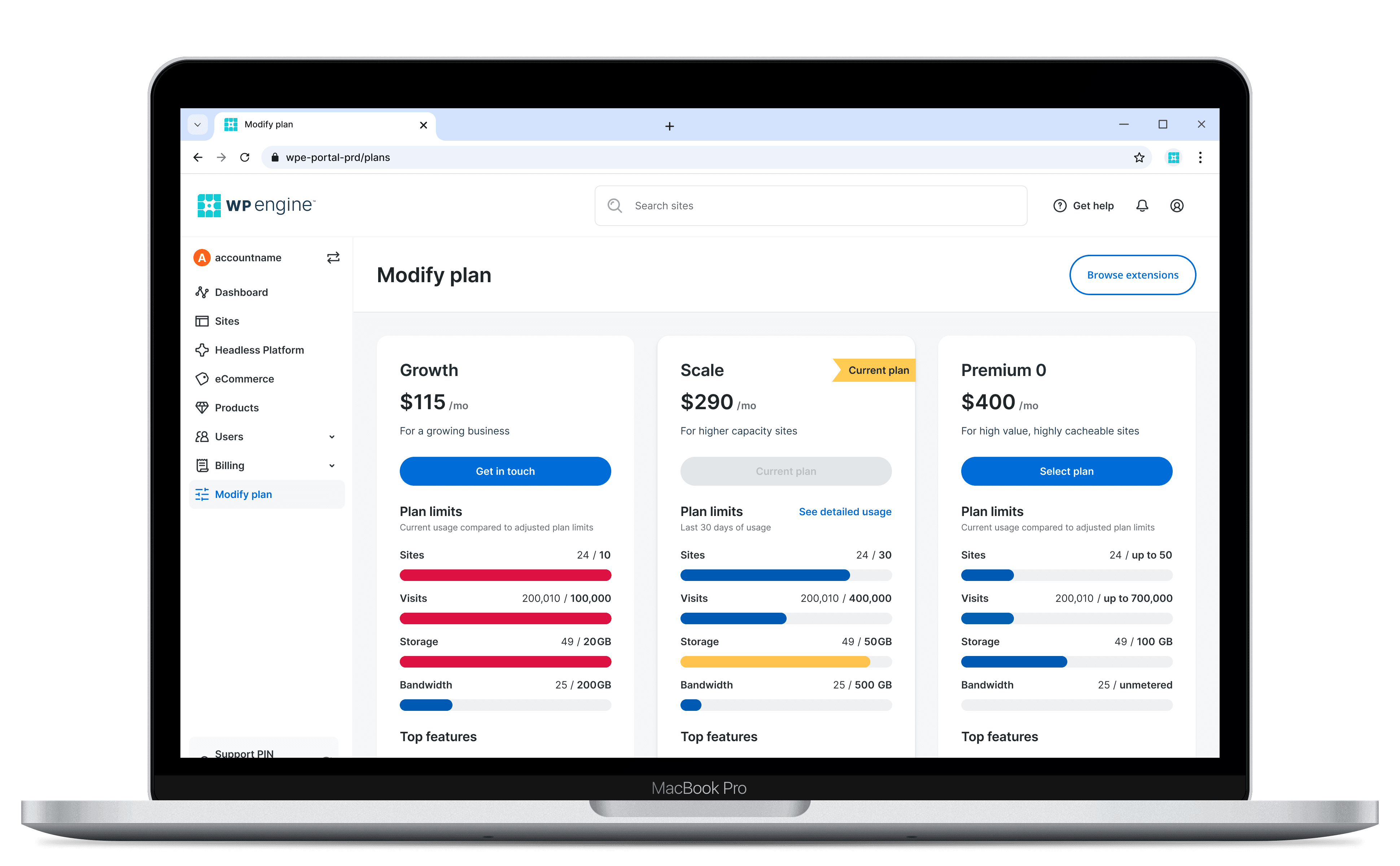
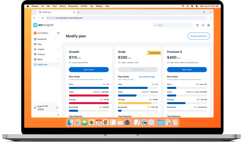
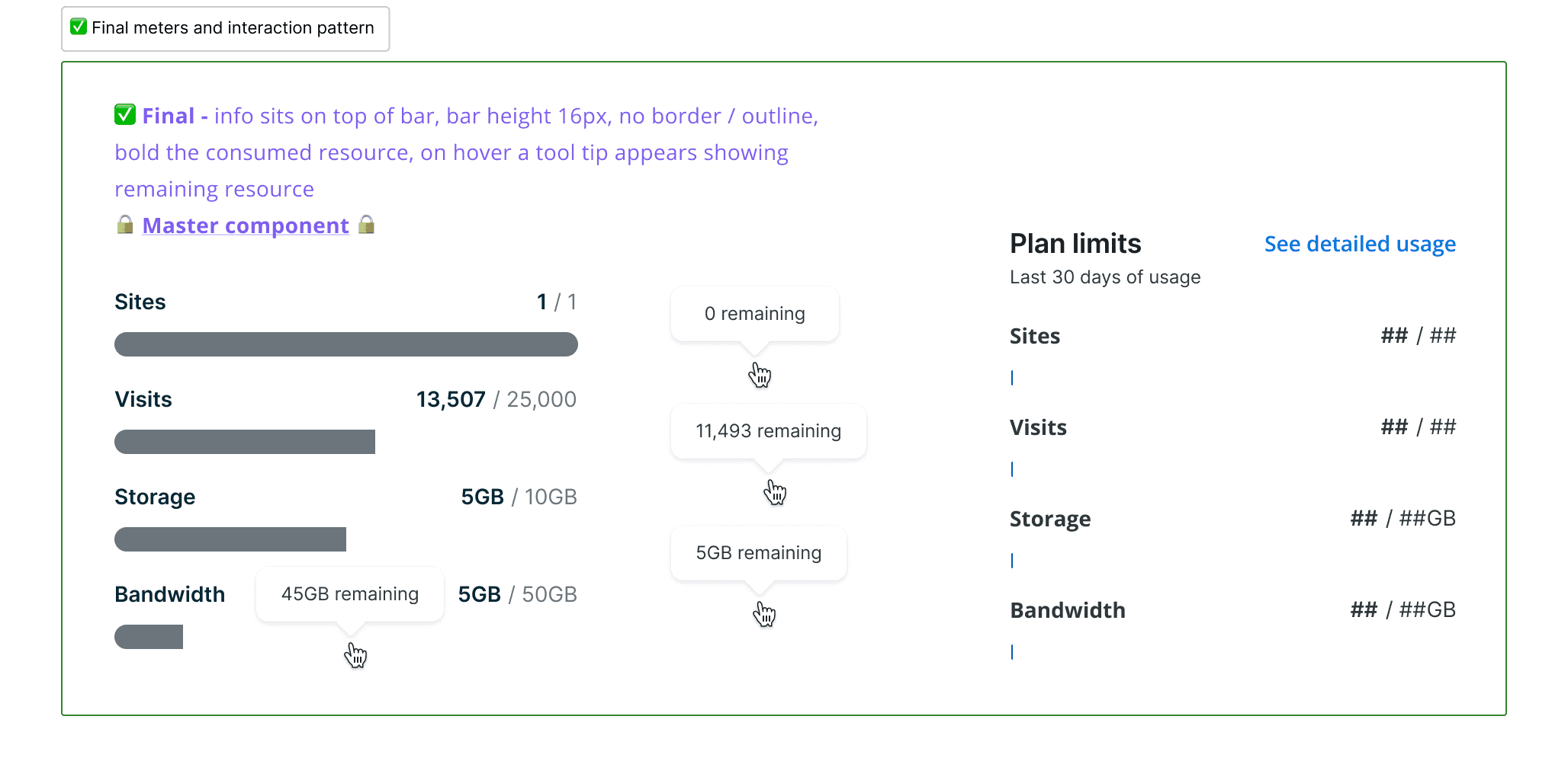
Simple usage meters eliminated user friction and ambiguity. Customers ready to upgrade could decide faster once they saw their last 30 days of usage.
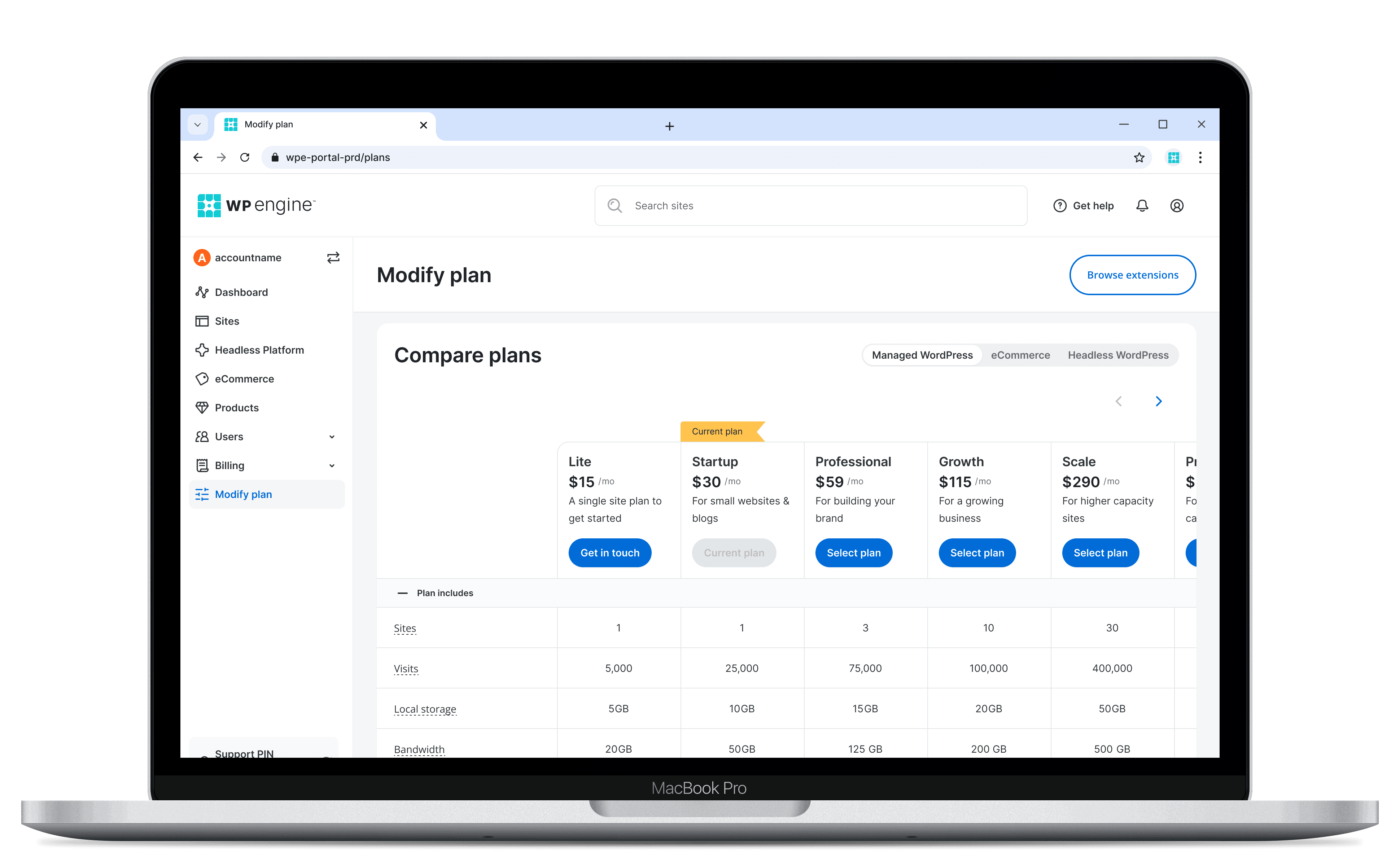
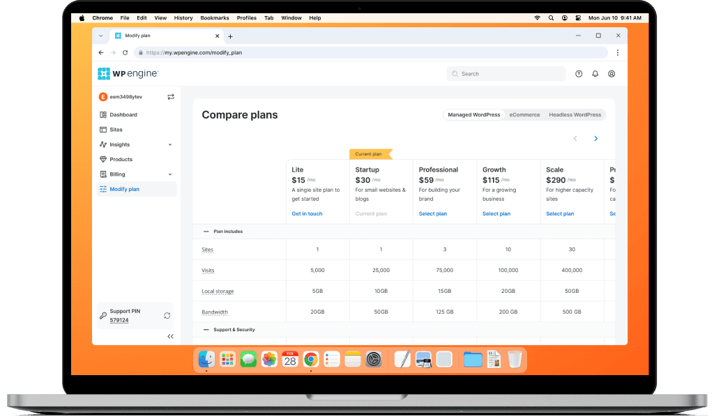
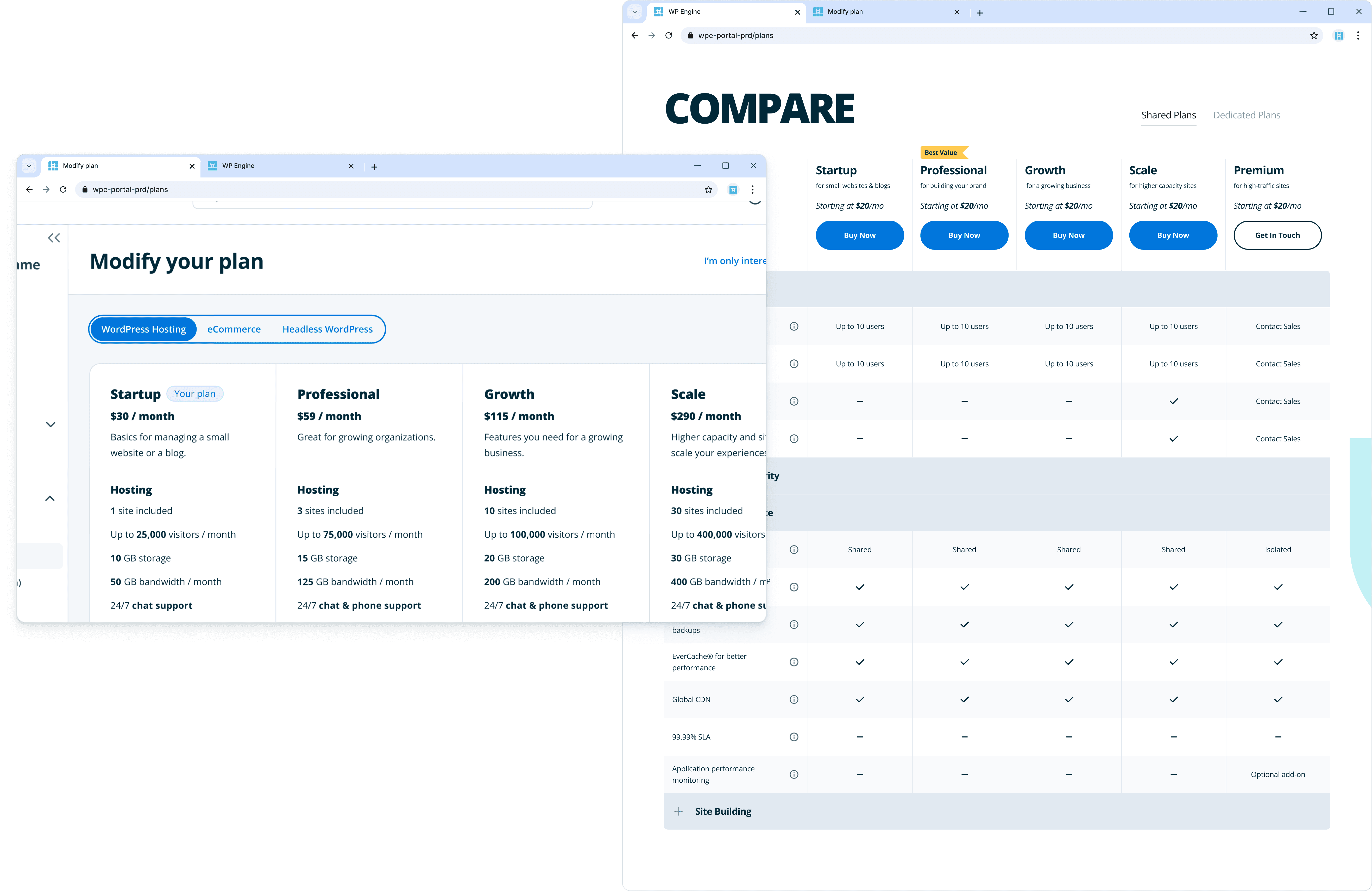
Replacing a listicle with a feature table
For more technical users, seeing specs like server type provided transparency. Previously, customers had to open the marketing website to compare plans, and the plan names weren’t much help.
Want a look behind the scenes?
View the designer's cut and see the process behind the work.

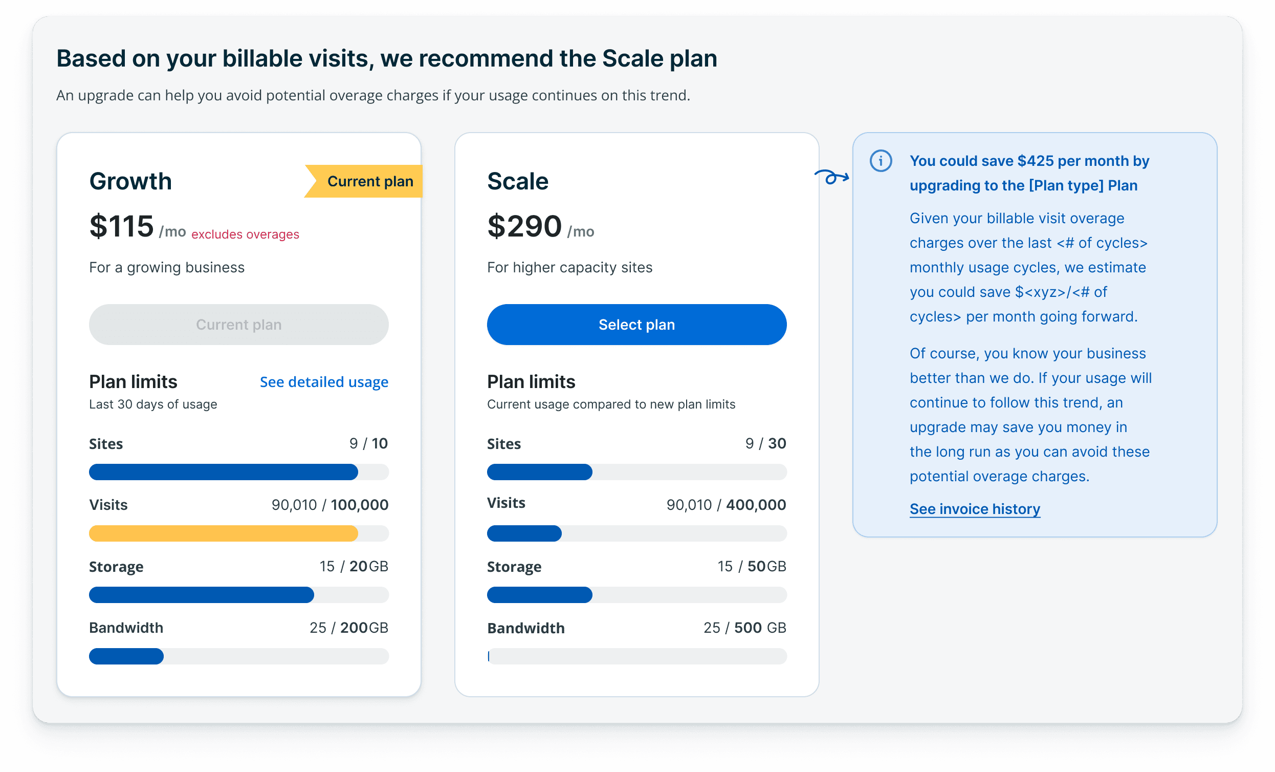
By changing this one UI element the narrative shifted from aggressive upselling to data-driven transparency
Overview
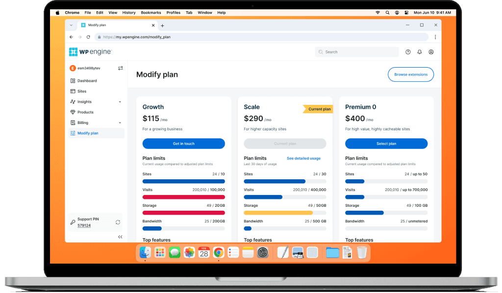
Simple usage meters visualized the customer's 30-day usage to help them make informed decisions.
This data transparency resulted in 127 plan upgrades over a 40-day period (average 3 per day).
Project details
Company
WP Engine
Leading WordPress hosting providing fast, secure, and scalable solutions
Role
Designer + Research
End-to-end design, Prototyping, Interaction design, User interviews
Team and Stakeholders
10+ People
1 Product manager, 8 Developers, 1 Engineering manager, 1 Data analyst, 1 UXR
Timeline
4 Months
Dec 2023 – Apr 2024
Tools
Various
Figma, Zoom, Looker Studio (track conversions), Segment (customer tracking), Miro, Pendo (user journey).
Type
Desktop
Redesign and flow enhancement focused on data-transparency and migration to a self-serve platform.
The problem
Customers struggle to understand the resource consumption of their current plan, which makes decisions and plan changes feel confusing and incomplete.

Research
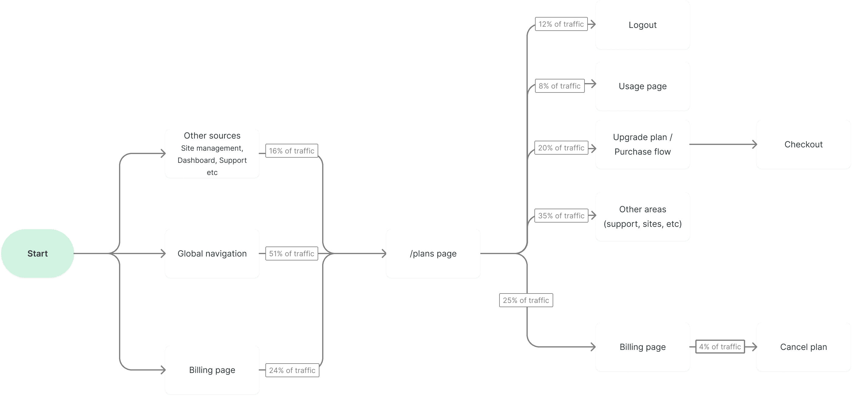
Users who accessed the Plans page through global navigation were the most likely to convert, making it a key surface for cross-selling and upgrades.
Customers that viewed the following pages: Plans, Usage, and Billing revealed that they were searching for usage information.
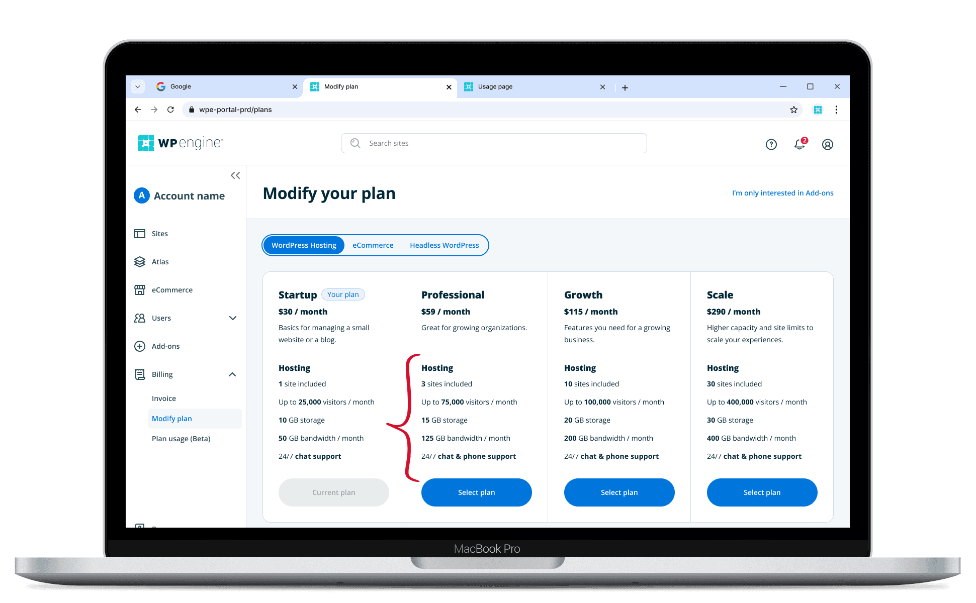
Pain points for the existing plans page
Traditional plans page provided little value to 6k monthly visitors
The current page was designed for browsing, not plan management. It lacked usage data, resulting in users seeing an incomplete picture of their plan.

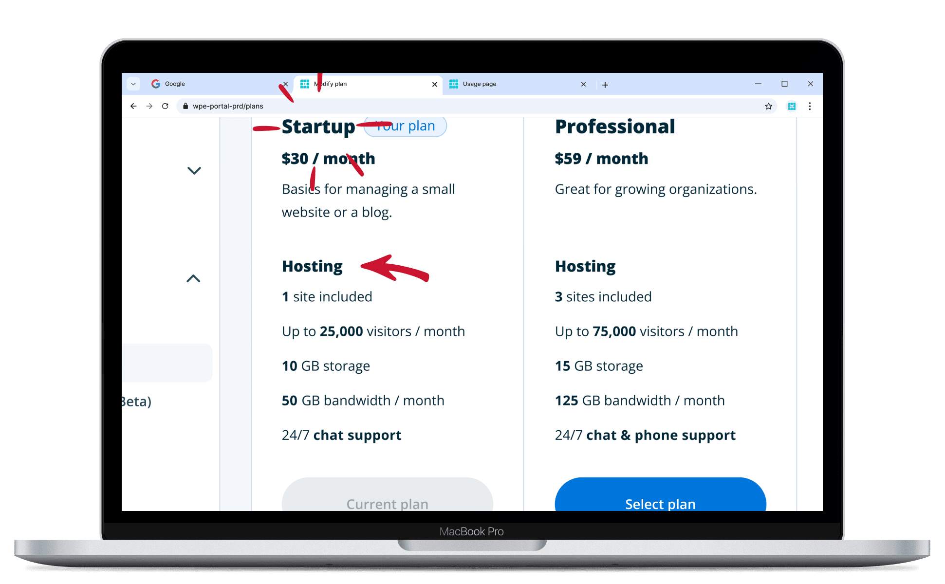
Users manually compare multiple tabs while others navigate away
Highly engaged users (looking to upgrade their plan) would open multiple browser tabs to compare usage and feature lists.

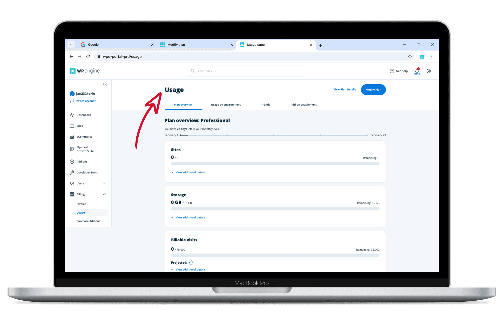
For the less-engaged users, the impact and motivation were speaking volumes
Generic plan names, lack of data was enough friction for 1,500 to leave the page immediately. And 240 ultimately cancelled their plan.


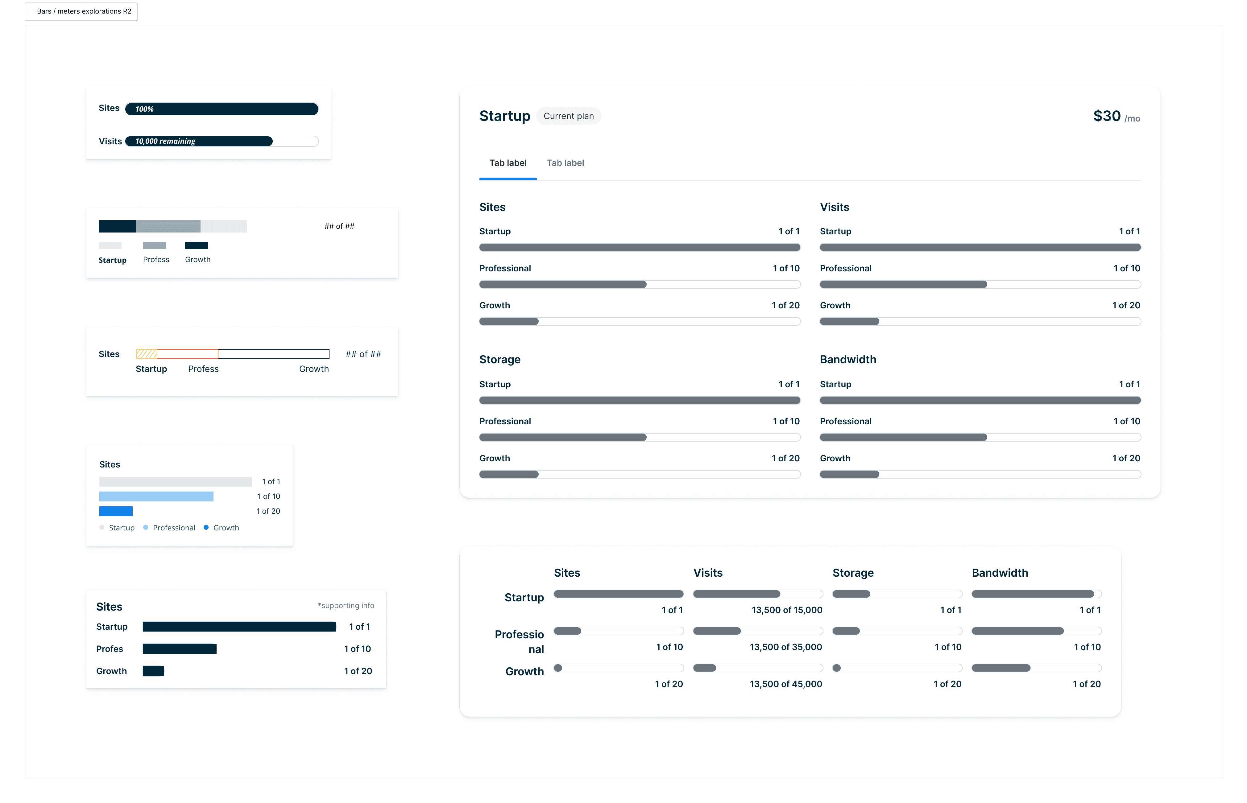
A simple view of their last 30 days
Research indicates their usage is highly relevant to decision making. Showing a simple summary of what their plan includes can simplify their multi-tab workflow.
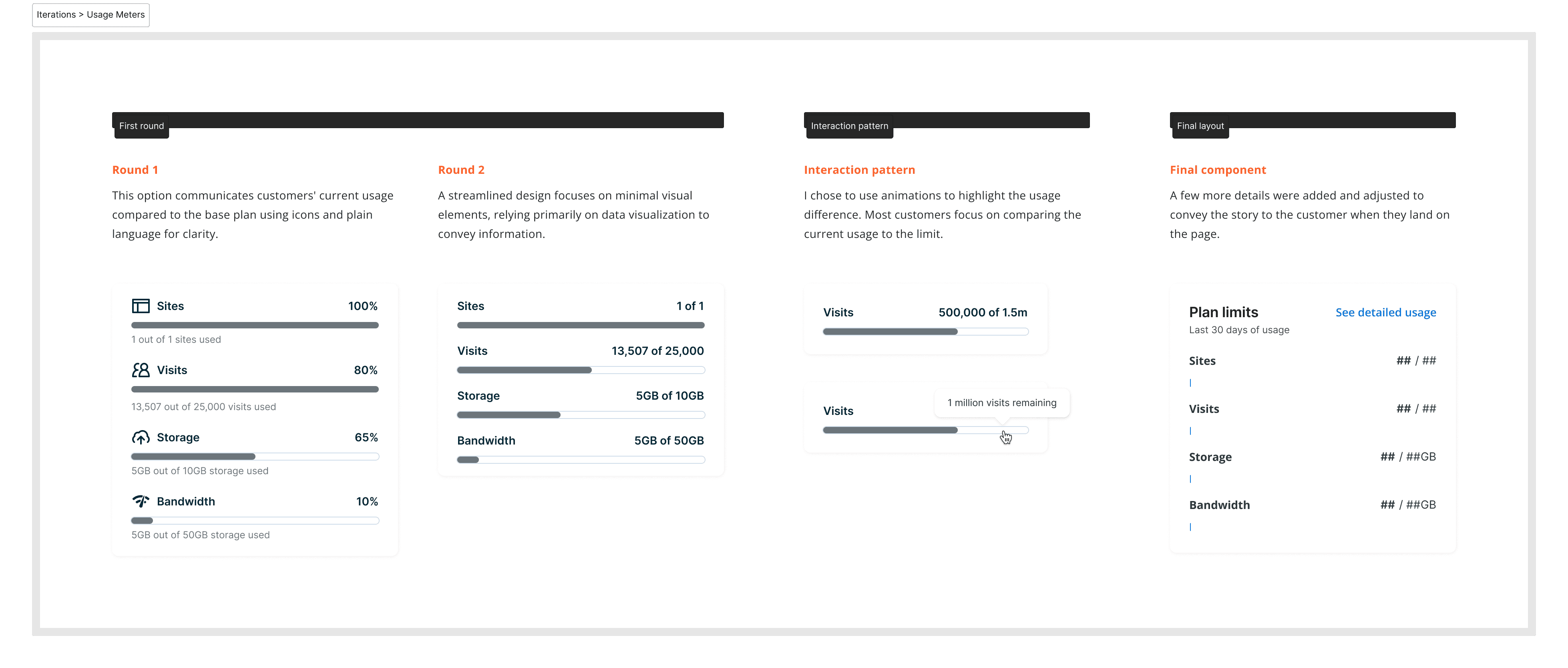

Users manually compare the marketing page to compare feature sets
A feature table replaced the plan list, so technical customers could compare specs like server type in one place.

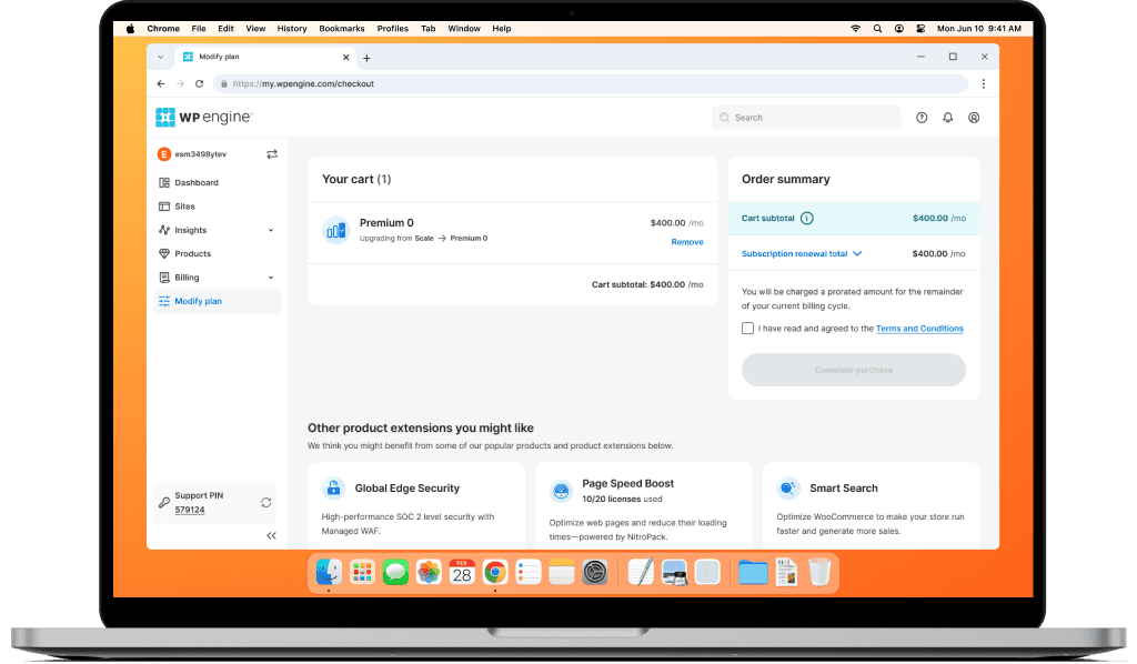
To promote customer trust we provide recommendations purely based on their usage
Recommendations now come only from a customer’s own 30-day usage, not from upsell prompts.
Solution
Simple usage meters eliminated user friction and ambiguity
Customers ready to upgrade could decide faster once they saw their last 30 days of usage.
Replacing a listicle with a feature table for technical specs
For more technical users, seeing specs like server type provided transparency. Previously, customers had to open the marketing website to compare plans, and the plan names weren’t much help.