Empowering LA residents via web app to find essential resources and shelter
By conducting user research, I designed a simpler experience for a non-profit to increase engagement and drive social impact.
Type:
Feature enhancement for a mobile web app
My role & team:
Lead researcher & designer, 1 product manager, 1 product owner, 2 developers
Tools:
Figma, Miro, Zoom
Duration:
5 weeks
Summary
LA based non-profit empowers residents by providing a comprehensive directory of free and subsidized resources.
The Problem: COVID exacerbated food insecurity, forcing many to visit pantries to fulfill basic needs.
Solution: Adding real-time updates and relevant listing details to connect users with nearby food & shelter.
Social impact: The platform saw increased user engagement and garnered recognition from the Department of Public Health, expanding to Northern California.
The problem
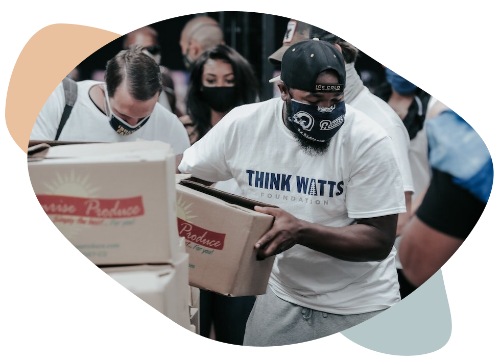
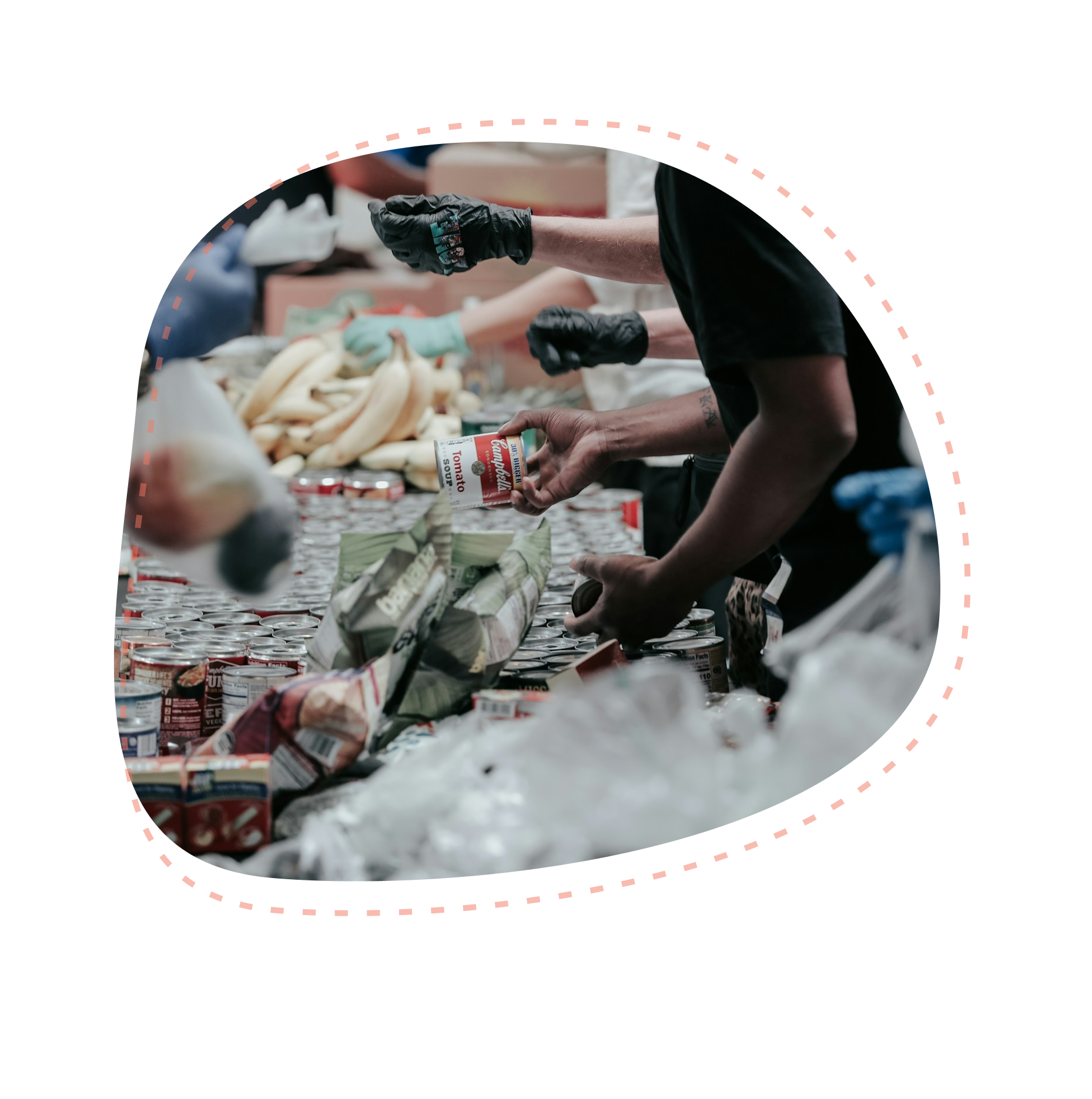
During COVID, users spent hours waiting at multiple locations, with no guarantee of finding essential resources. This caused significant stress and wasted valuable time.
Uncovering user needs & challenges through user interviews
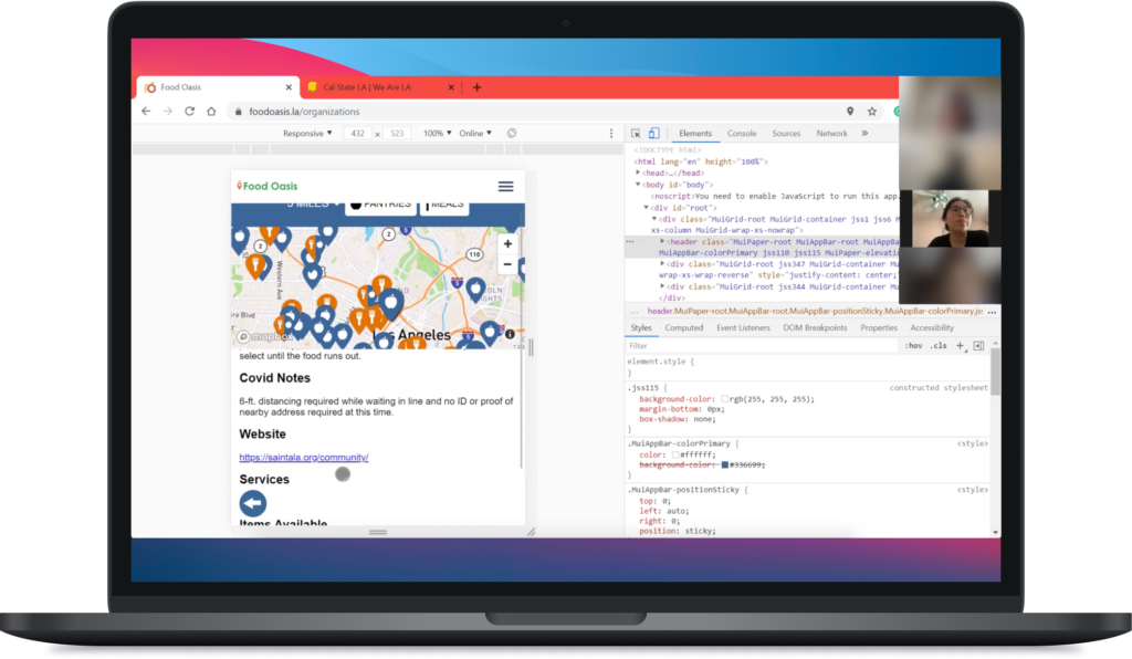
- Task-based observation: We asked participants to search for resources within the web app. This allowed us to identify usability issues and understand their behavior.
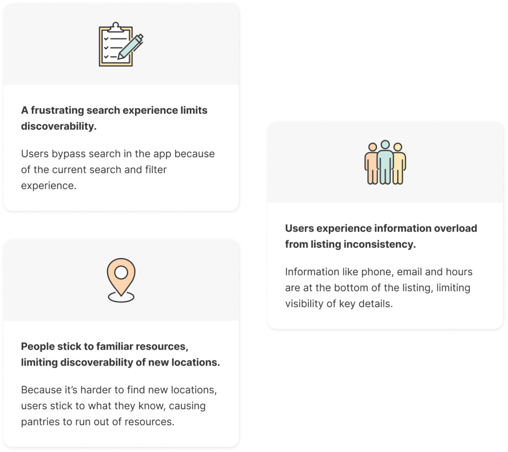
- How do they search: We wanted to understand how they typically search for resources outside of the app to gain valuable insights into their process.
The current process of finding resources is primarily via word of mouth
“A friend told me about a pantry [that’s] open every Friday 3-5pm. That’s easier for me to remember. I probably wouldn’t do any more investigating besides going there. It’s a risk, because you don’t know what they’re giving.”

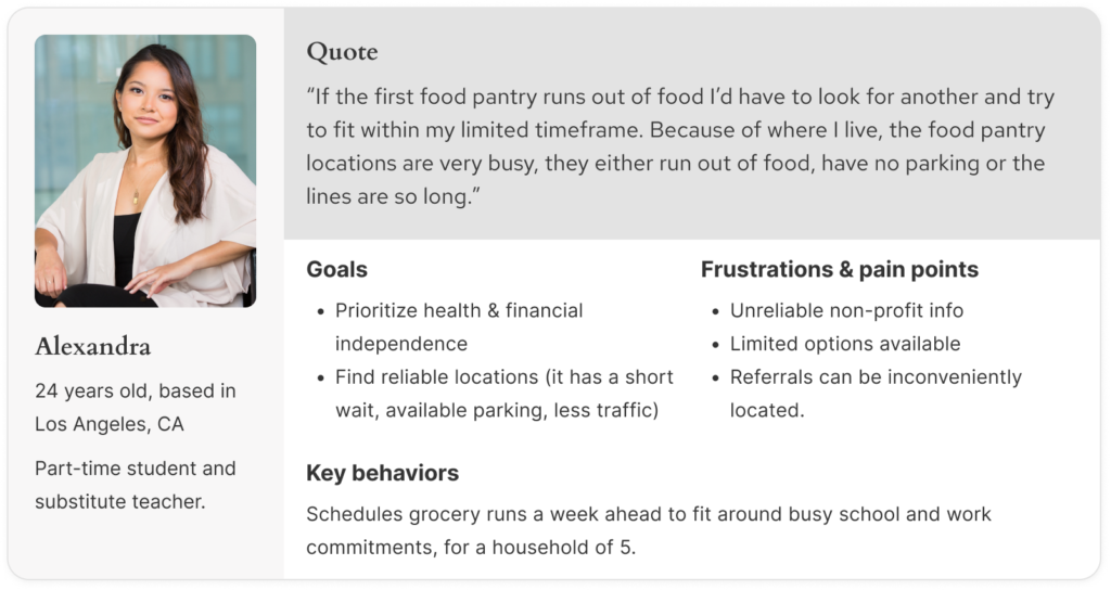
Meet Alexandra
- She’s a full time student juggling a part time job to cover basic necessities.
- She wants to secure resources for her family every week at an organization close to home.

Project Principle
Streamline accessibility with clarity
Prioritize accessibility by minimizing steps and simplifying language in resource searches.
Current state of the product
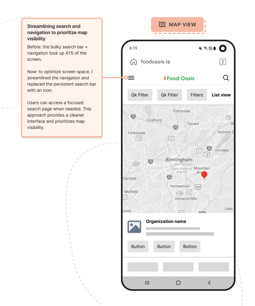
- Navigation and search take up 41% of the screen, limiting content visibility.
- The filters struggle to manage 1k+ organizations, causing cognitive overload.
- Operating hours and contact information are outdated or missing, creating frustration for users.


“How might we…”
- Encourage users to learn more about the organization(s) listed?
- Take the fear out of visiting a new location?
- Instill confidence that the information provided is up to date and accurate?
Initial concepts
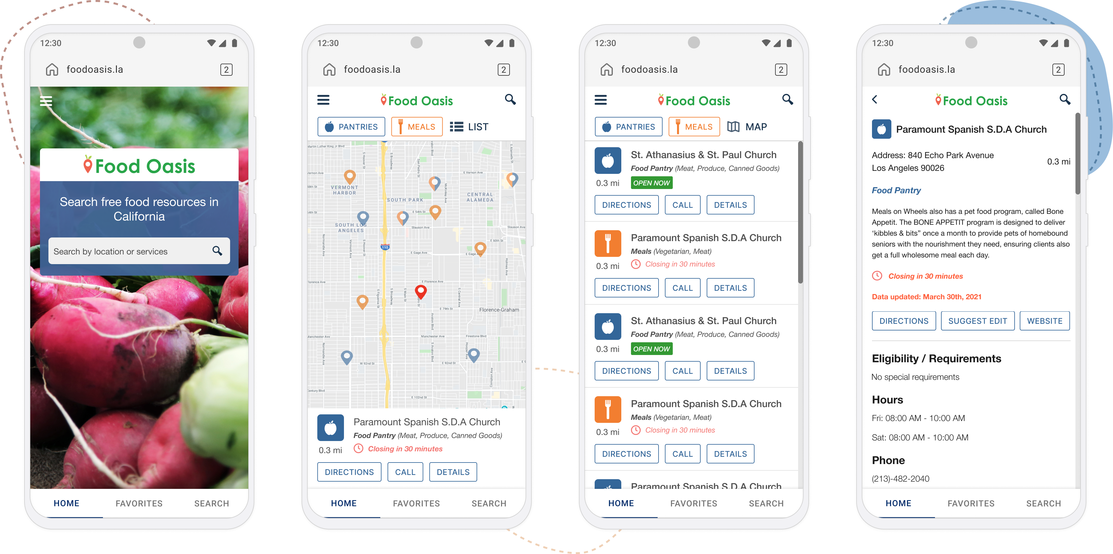
Map view
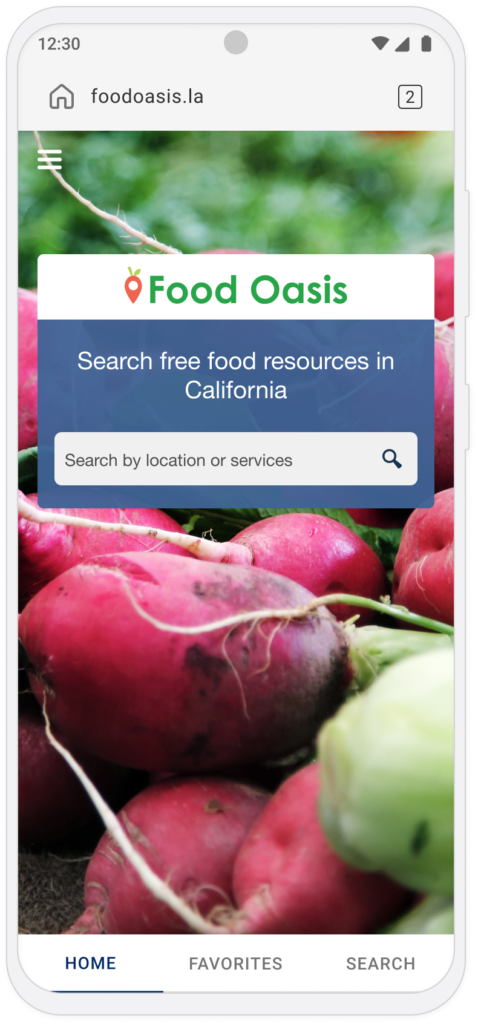
With this approach, users can access a page just for search, as needed. Providing a cleaner interface and prioritizes the map view.
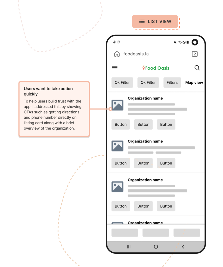
List view
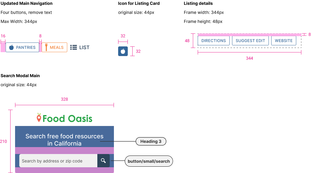
To build trust between users and the product I chose to show the CTA buttons on the surface of the list view, making typical actions more accessible.
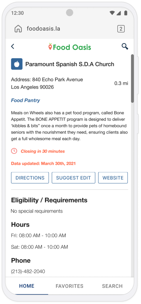
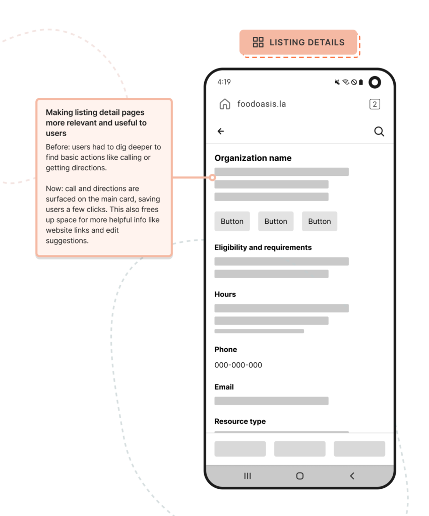
Listing details
Users usually look for directions, contact info, and eligibility first. The new design puts this info upfront, so they don’t have to scroll.
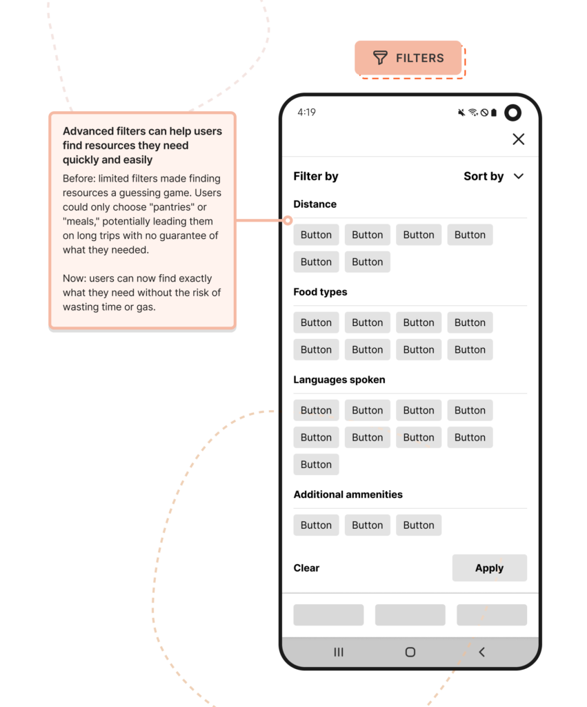
Filters
Filters can enhance the user experience greatly by refining their search results, but with limited resources (consistent staff) and complexity around implementation, we prioritized other functionalities to ensure we met the deadlines.
Before and after
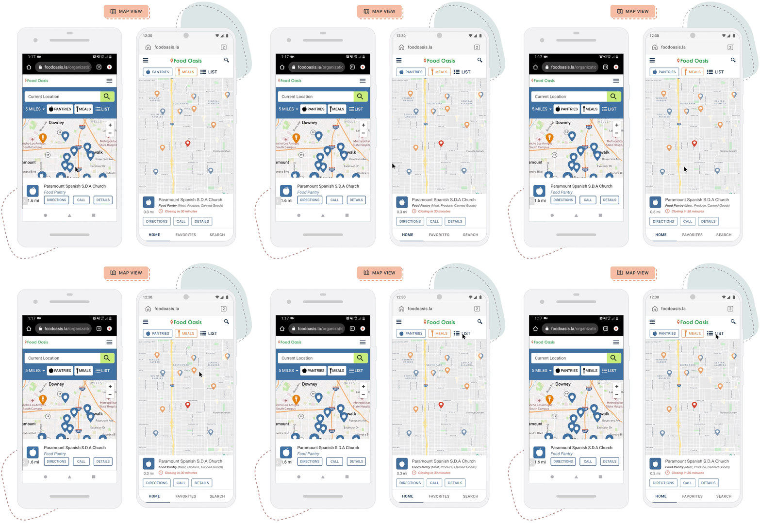
Map view
- Surfaced CTA buttons
- Streamlined navigation & search
- Reveal time windows
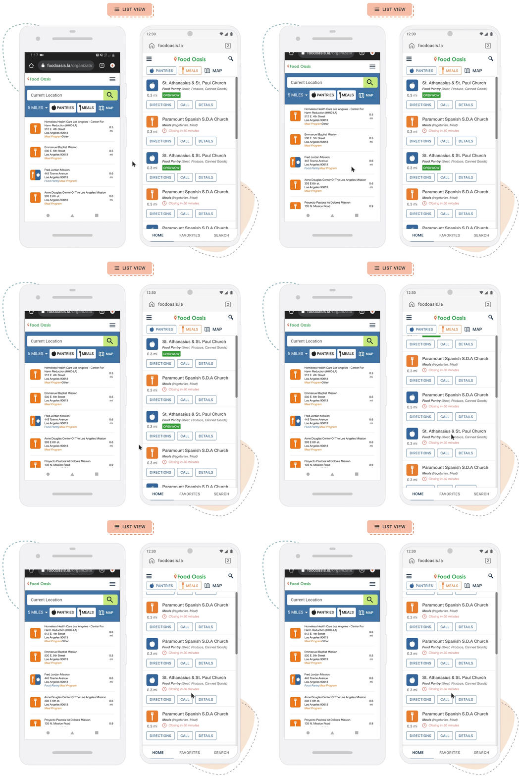
List view
- Surfaced call to action buttons on the card itself
- Reveal time windows
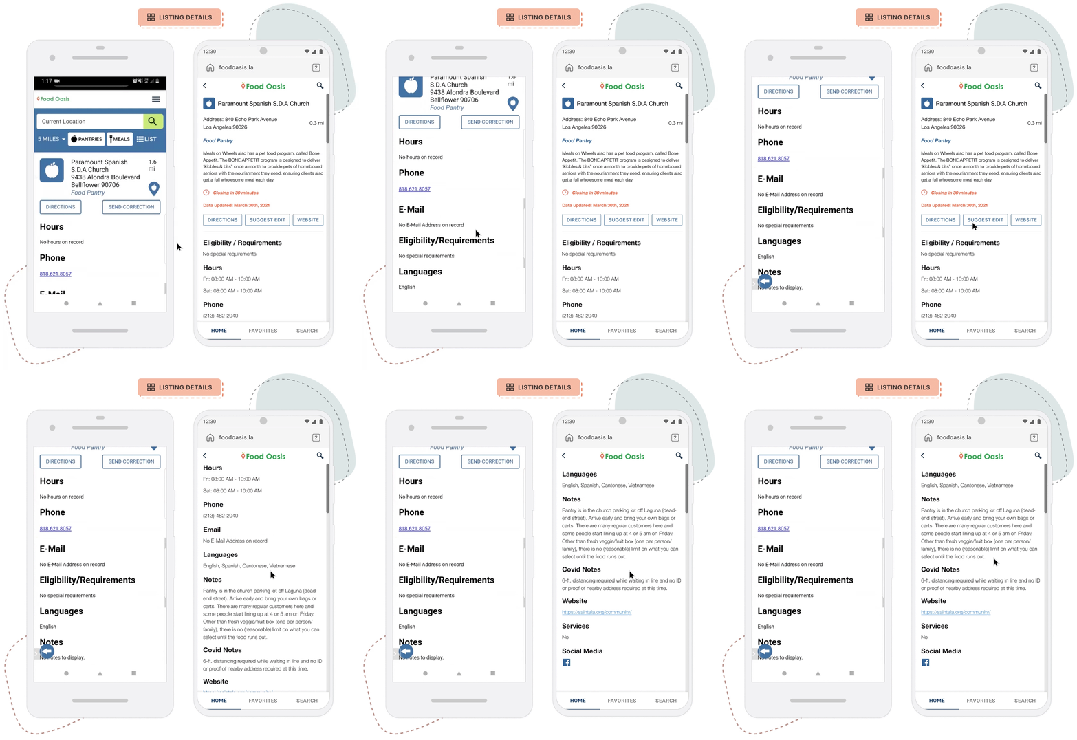
Listing overview and details
- Time windows of availability and general operating hours
- Last updated status
- Information based on user ranking
Final screens

Tackling challenges
- Lack of testing and metrics that tie back to the users.
- Inconsistent manpower affects expected outcomes.
Outcomes
- Advanced filters will be for a later release.
- Users reported “the improvements are a great start.”
Lessons learned
Prioritizing user needs starts with direct conversations and additional research to inform design decisions and ensure successful changes.
SHOPPINGGIVES
Redesigning how businesses can increase their social impact and brand loyalty.
WP ENGINE
Redesigning how businesses can increase their social impact and brand loyalty.
