OVERVIEW
Food Oasis is a non-profit that maintains an updated database of meal and pantry locations within California. This project aimed to enhance the user experience of the mobile web app by improving usability and efficiency in locating resources through user-centered design and direct user feedback.
Mission: Food Oasis is a web-based directory that connects people to free food resources in Los Angeles.

Maintain a directory of pantries and meal programs

Entirely volunteer led
ROLE AND DURATION
Researcher and designer
May 2021 – July 2021 (5 wks)
Team
1 Product Manager
1 Product Owner
1 Developer
MY ROLE
I conducted user research through interviews to identify challenges food seekers faced when using the mobile web app. I translated these insights into wireframes and mockups, focusing on improving navigation, accessibility, and overall usability to help users find food resources more efficiently.
APPLIED SKILLS
User Interviews, UX Research, Competitor Analysis, Design Thinking, Wireframing, Prototyping, Visual Design.
THE PROBLEM
Challenges with the current experience
Food seekers in Los Angeles needed a faster and more efficient way to find nearby open food resources, especially in urgent situations. The existing Food Oasis mobile web app provided access to these resources, but users struggled with its usability. The goal was to optimize the experience while preserving its core functionality, ensuring that users could quickly and easily access the support they needed.
DEFINITION
Food resources – Includes meal programs, food pantries, and shelters. These resources often require specific forms of eligibility, which vary by organization.
Food seekers – Individuals or groups who utilize these resources. They often need immediate access to resources.
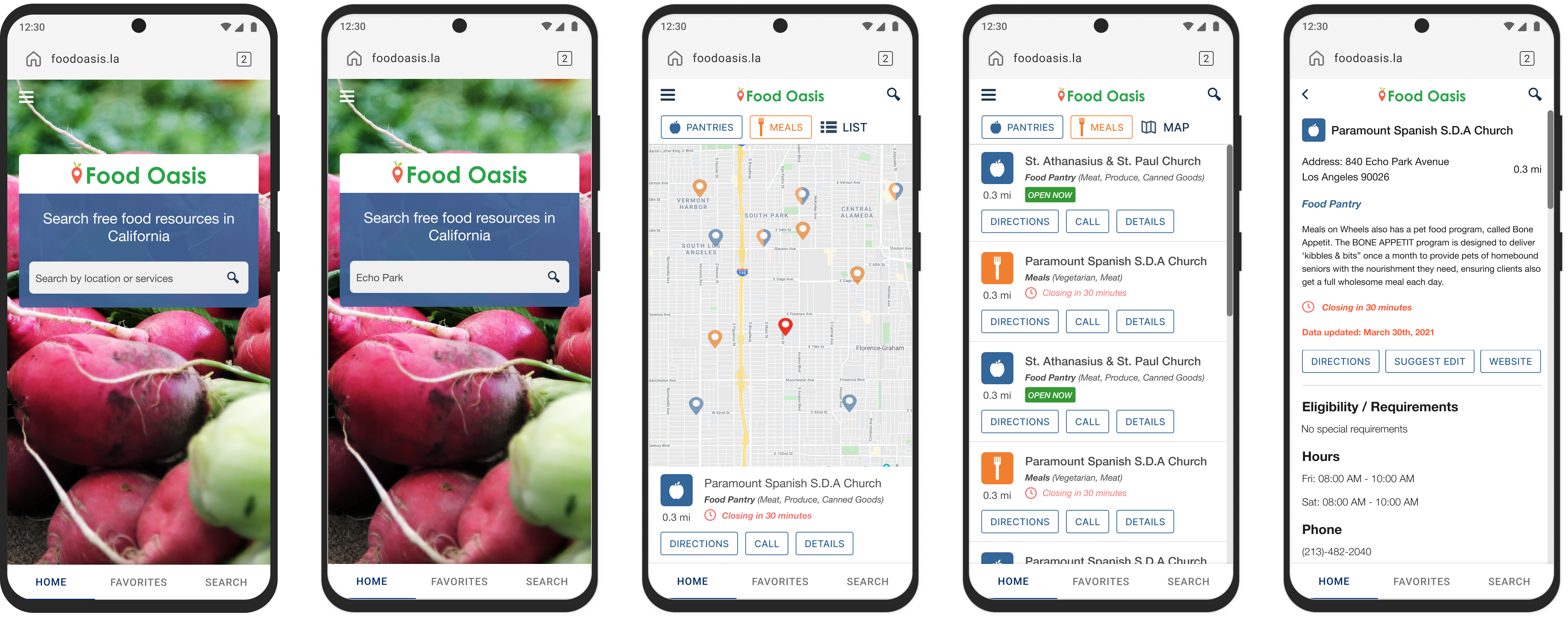
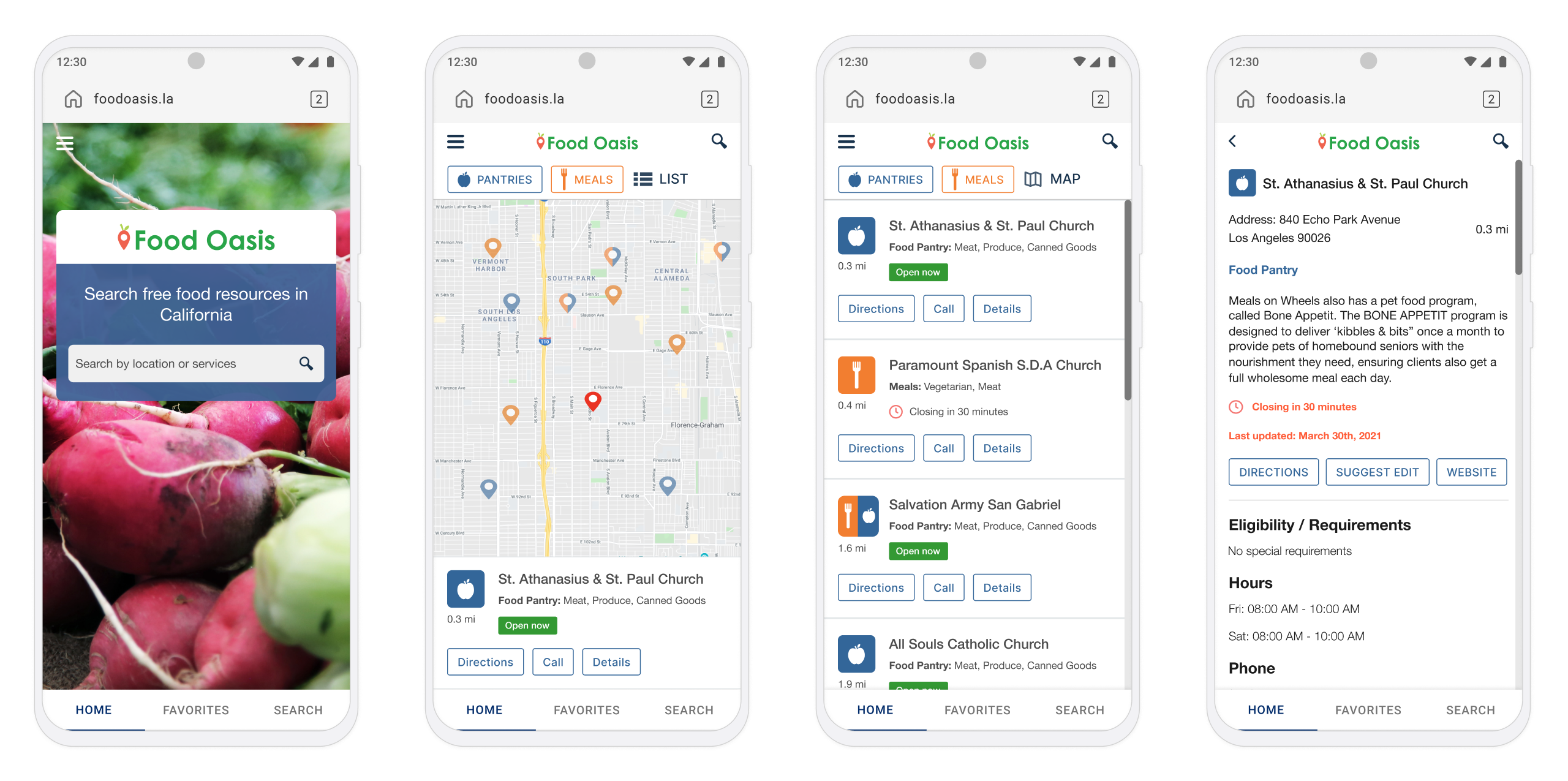
FINAL RESULT
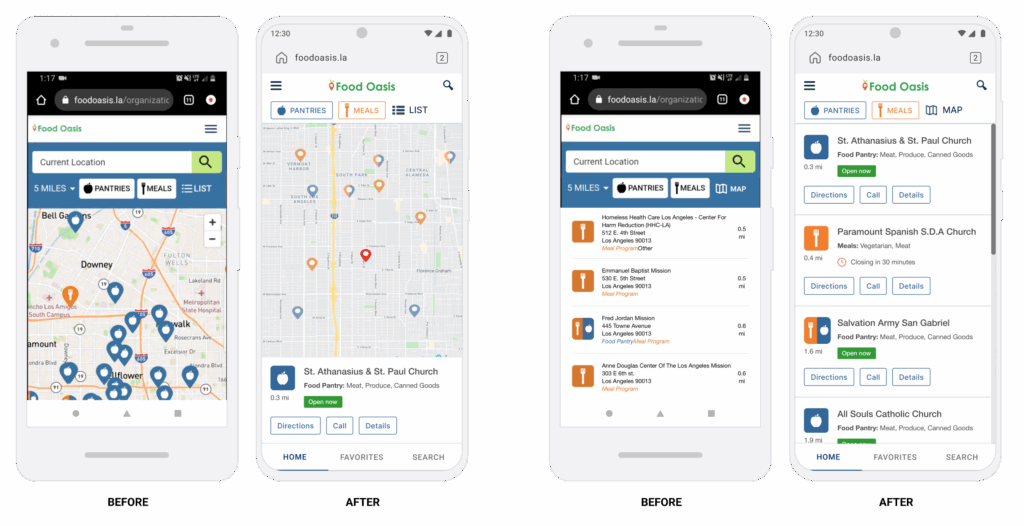
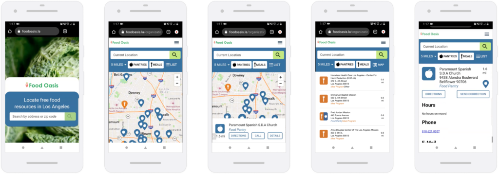
If you’re short on time, here’s a few key before-and-after screenshots.
The case study outlines the full process and iterations, and you can view the complete solution and results here.

RESEARCH AND ANALYSIS
For many in Los Angeles, finding food isn’t always easy, it’s a daily challenge.
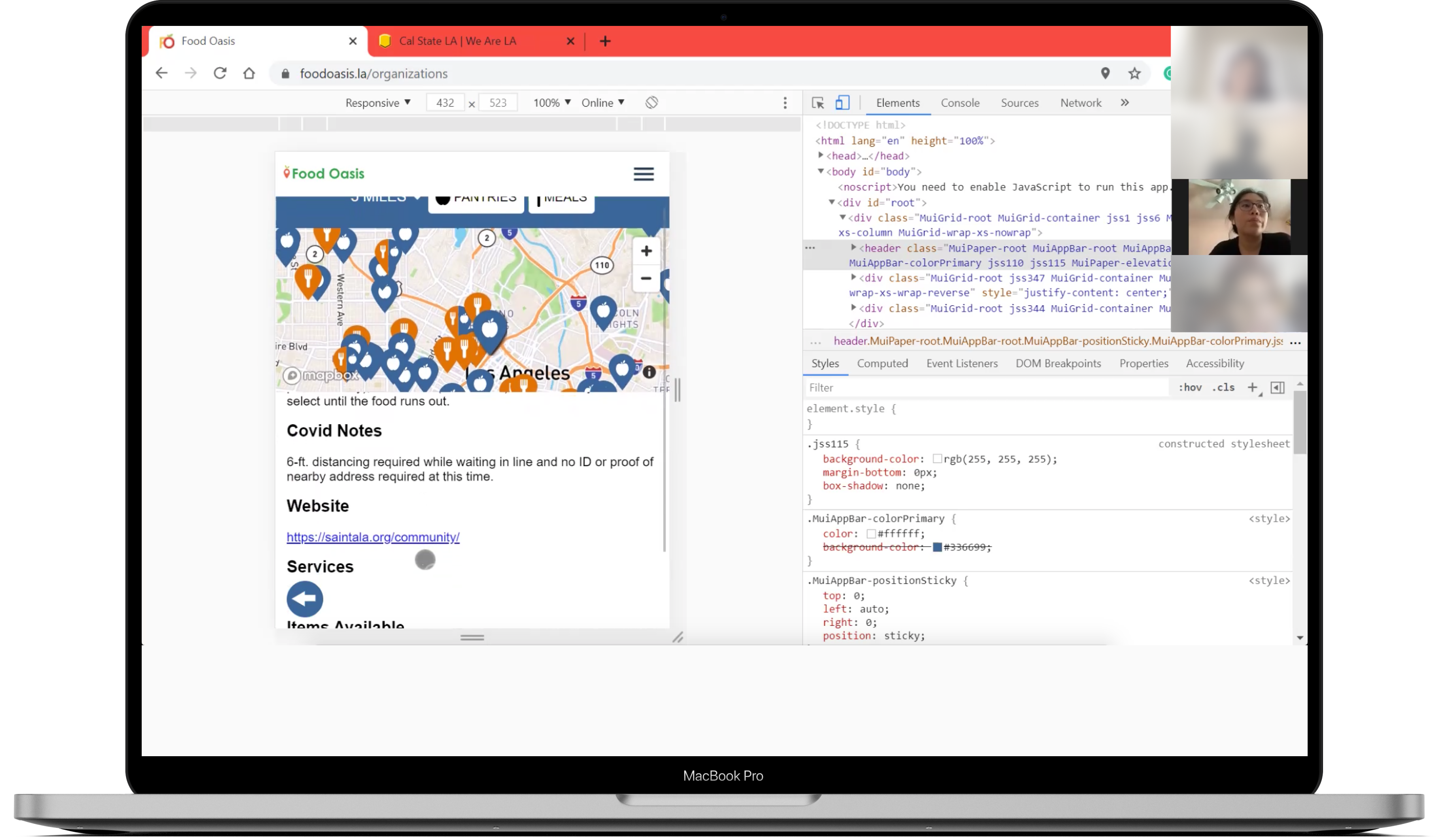
We conducted user interviews with two food seekers, guiding them through several tasks to understand their needs.
KEY FINDINGS
Food seekers require comprehensive information.
Beyond details like hours, location, and eligibility. Intuitive navigation tools, including filters and map/list views, are crucial for efficient decision-making.
Every day is a balancing act, managing planning alongside urgent needs.
This makes accurate information critical. However, volunteer-led updates often lacked consistency, leaving users unsure if the information they found was reliable.
Social and community influence plays a significant role.
Reliance on word-of-mouth is instantly more valuable than the Food Oasis database.
Additionally, dietary restrictions and resource availability are key factors, especially given the ‘first come, first served’ nature.
“When there’s so many things taken away at a time like this, you really find that the most important things are just being healthy, having like your family be healthy and being able to eat every day, you know… like not having to worry about the pandemic and if you’re sick or not, and then also worrying about, well, what am I going to eat tomorrow? Or do we have food?”
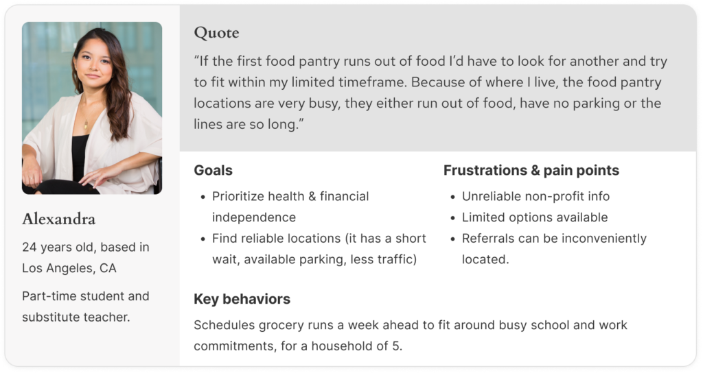
PERSONA
Alexandra the resourceful planner, is a busy student and part-time worker living in a crowded apartment with her family in downtown Los Angeles.
- Relies heavily on word-of-mouth and prior experience to find resources.
- Planning ahead is essential, as she juggles a tight schedule and needs to know precise hours and details.
- Values detailed information and social proof to avoid wasting precious time.
PAIN POINTS AND NEEDS
Limited time and unreliable information, hinders the ability to efficiently find trusted food resources in Los Angeles indicating a need for improved searchability in the database.
Food seekers report difficulty in planning
Struggles with time management due to difficulties in finding accurate and timely food resource information.
Currently distrusts information on Food Oasis
Past experiences with misleading or outdated information led to feelings of distrust with the organization.
Inherently limited access to resources
Reliance on word-of-mouth naturally limits access and discovery to different locations around LA County.
Need for community validation
Social proof like reviews and feedback not only creates trust around the quality of information, but makes validating locations harder.
Current state of the product
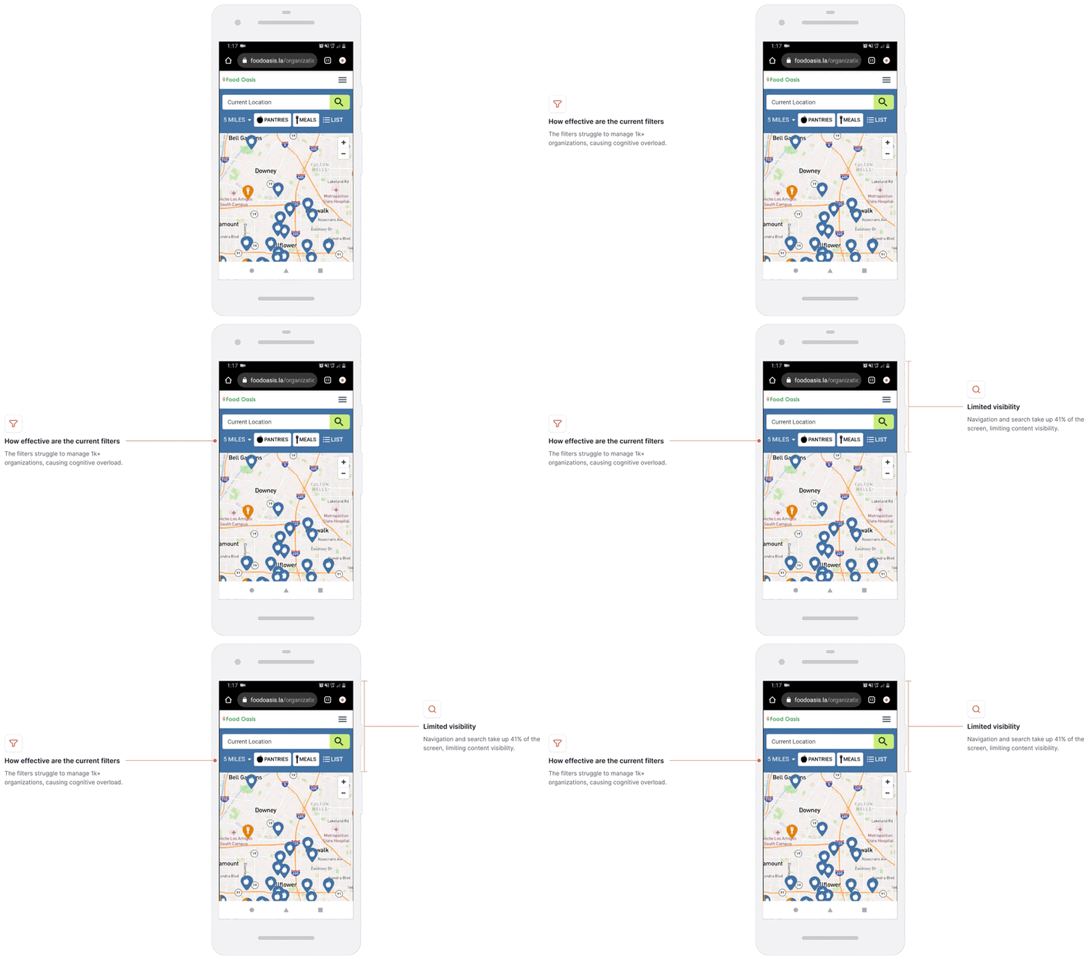
Food seekers struggle with the app’s filters, which aren’t helpful, and the top header and search bar block 41% of the screen, making it hard to view listings. Operating hours and contact information are often outdated or missing, leading to user frustration.

Design process
Analyzing the existing experience.
LIMITED FILTERS AND VISIBLITY
How effective are the current filters?
The filters struggle to manage 1k+ organizations, causing cognitive overload.
Limited screen visibility
Navigation and search take up 41% of the screen, limiting content visibility
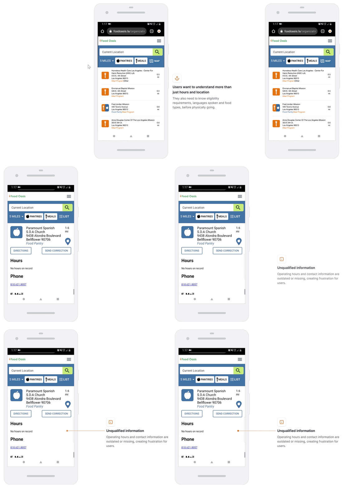
OUTDATED AND UNQUALIFIED INFORMATION
Relevant information is buried
Hours and location are essential for food seekers, but they also need to know eligibility requirements, languages spoken, and food types before visiting a location.
Unqualified information
Core information such as operating hours and contact information are outdated or missing, creating frustration for users.
HOW MIGHT WE…
I use the How Might We (HMW) framework because it helps me shift from simply identifying problems to actively exploring opportunities.

How might we make learning about organizations feel engaging and effortless?

How might we reduce uncertainty and make first-time visits feel welcoming?

How might we reassure users that the information they see is always current and reliable?
EARLY CONCEPTS
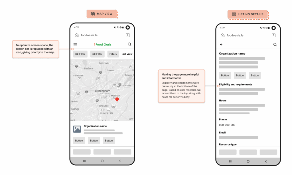
Map view
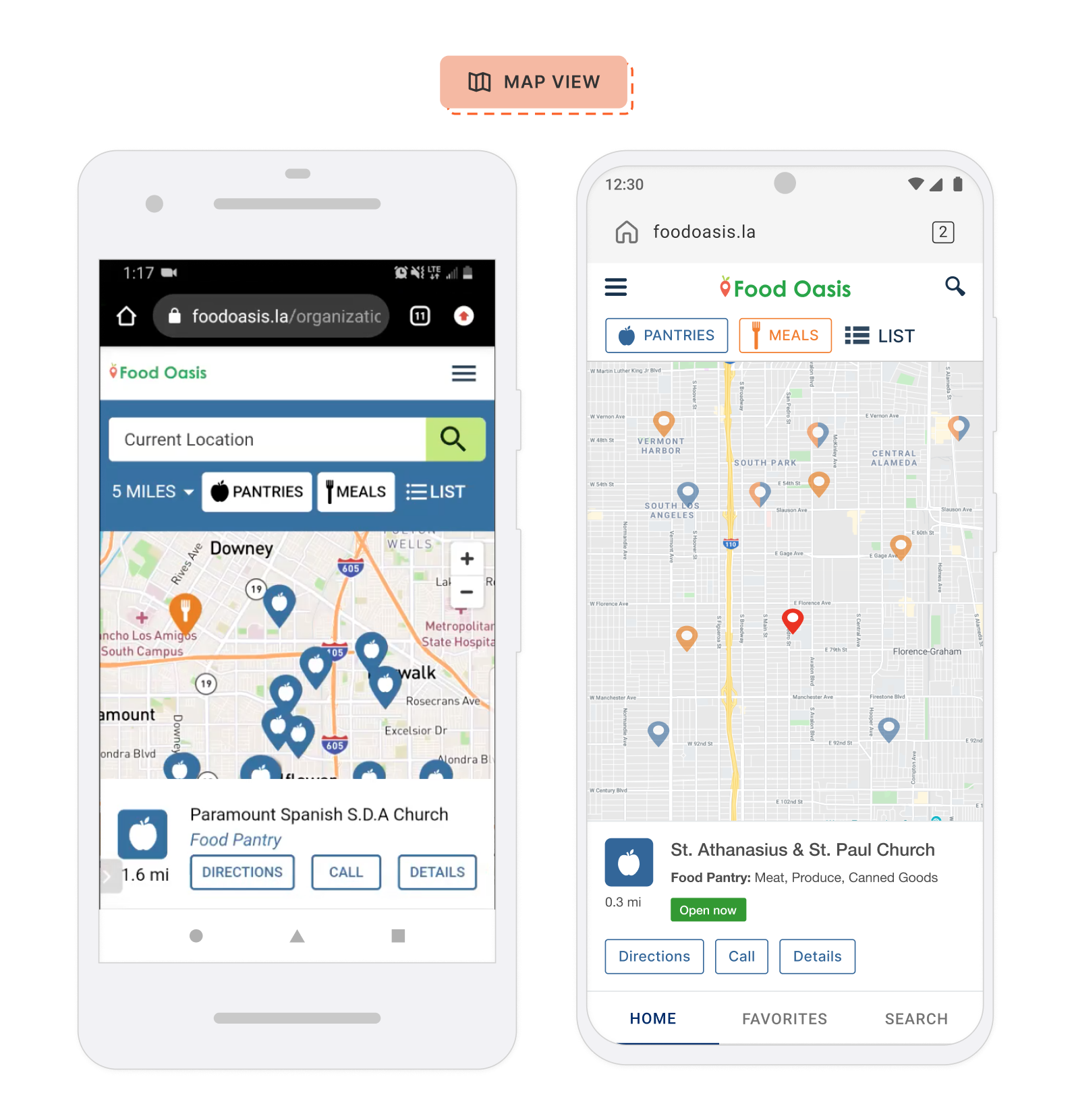
With this approach, users can access a page just for search, as needed. Providing a cleaner interface and prioritizes the map view.
List view
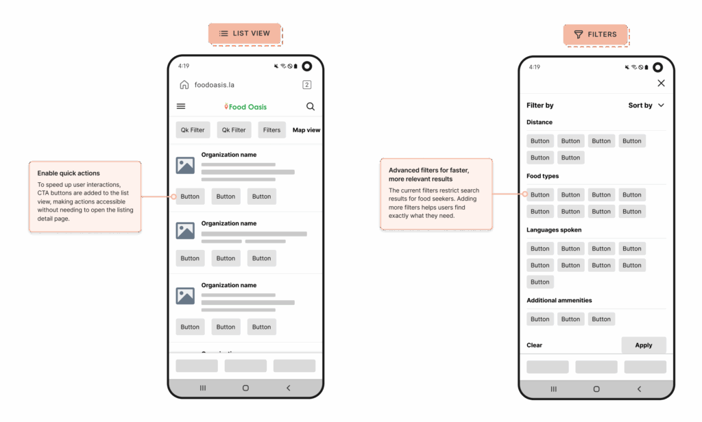
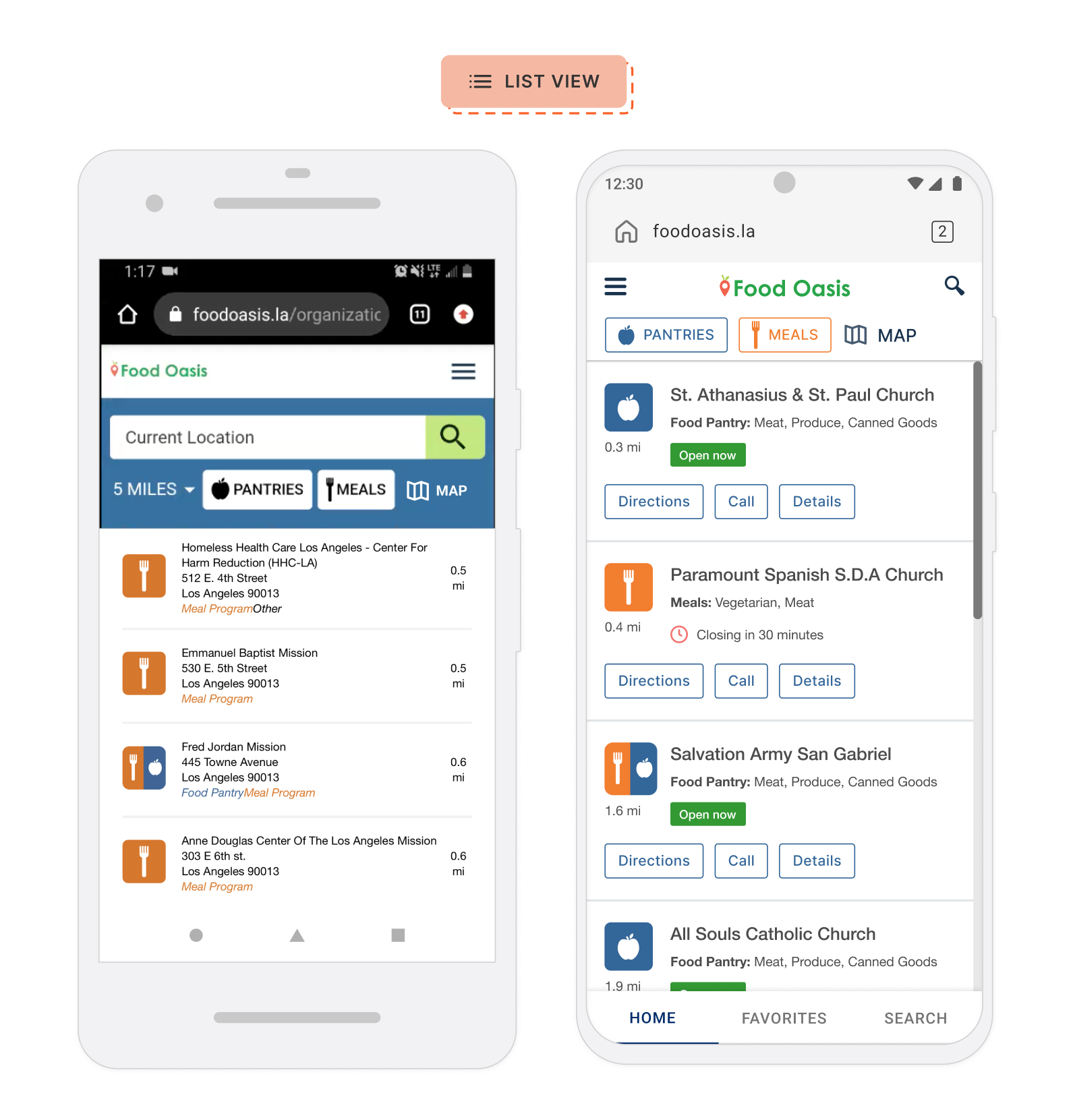
To build trust between users and the product I chose to show the CTA buttons on the surface of the list view, making typical actions more accessible.
Listing details
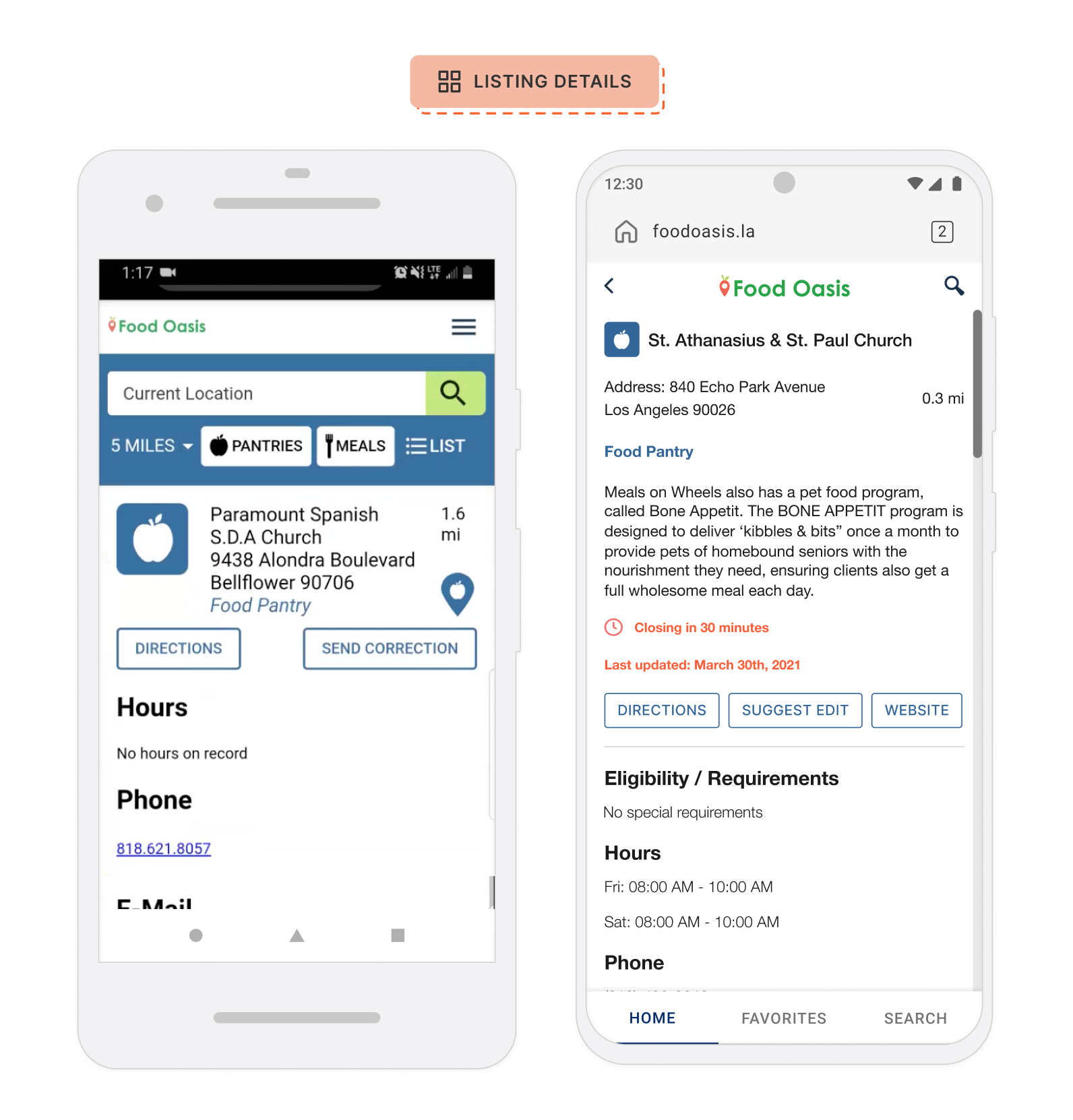
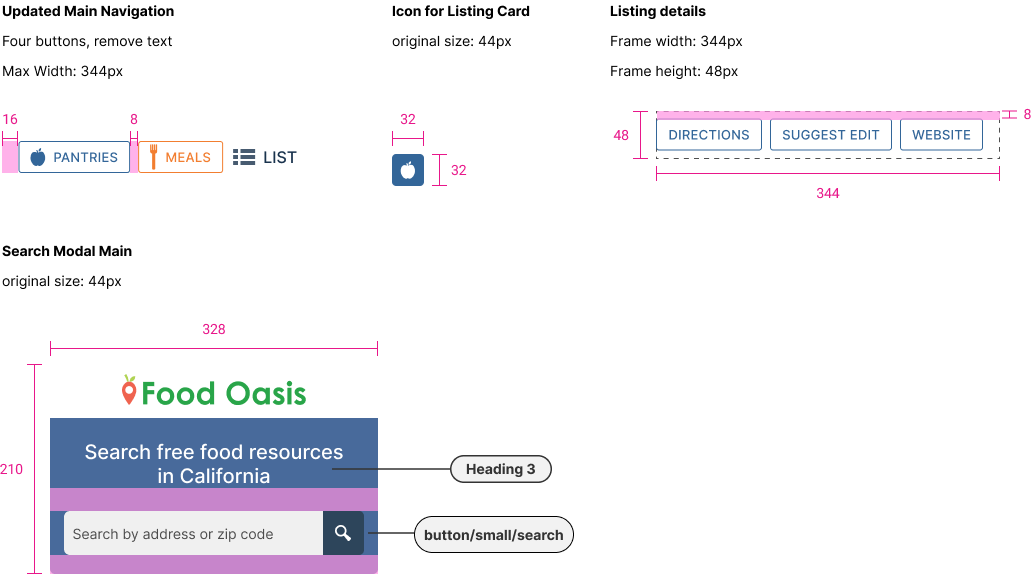
Users usually look for directions, contact info, and eligibility first. The new design puts this info upfront, so they don’t have to scroll.
Filters
Filters can enhance the user experience greatly by refining their search results, but with limited resources (consistent staff) and complexity around implementation, we prioritized other functionalities to ensure we met the deadlines.
FINAL SOLUTION
Map view
- Surfaced CTA buttons
- Streamlined navigation & search
- Reveal time windows
List view
- Surfaced call to action buttons on the card itself
- Reveal time windows
Listing overview and details
- Time windows of availability and general operating hours
- Last updated status
- Information based on user ranking
FINAL SCREENS AND HANDOFF
OUTCOMES AND IMPACT
The redesigned Food Oasis platform provided a scalable and intuitive foundation for growth. As of 2024, the platform has achieved:
Sustained User Growth:
As of 2024, the platform attracts 400 new users daily, proving the redesign’s ability to effectively onboard and engage individuals from their very first visit.
Significant Community Reach:
The platform now supports 4,500 monthly active users, a testament to the trust and reliability established by the intuitive user experience.
Lesson Learned: Design for the Future:
This project reinforced the importance of creating scalable design systems. The core components and flows designed years ago have required minimal changes, allowing the organization to focus on outreach and expansion.
LESSONS LEARNED
Tackling challenges
The volunteer-based nature leads to inconsistent testing, metrics, and manpower, impacting user insights and expected outcomes.
Social impact
Advanced filters are planned for a future release.
Start with research
Prioritizing user needs begins with direct conversations and research, guiding design decisions for effective improvements.
More case studies

ShoppingGives
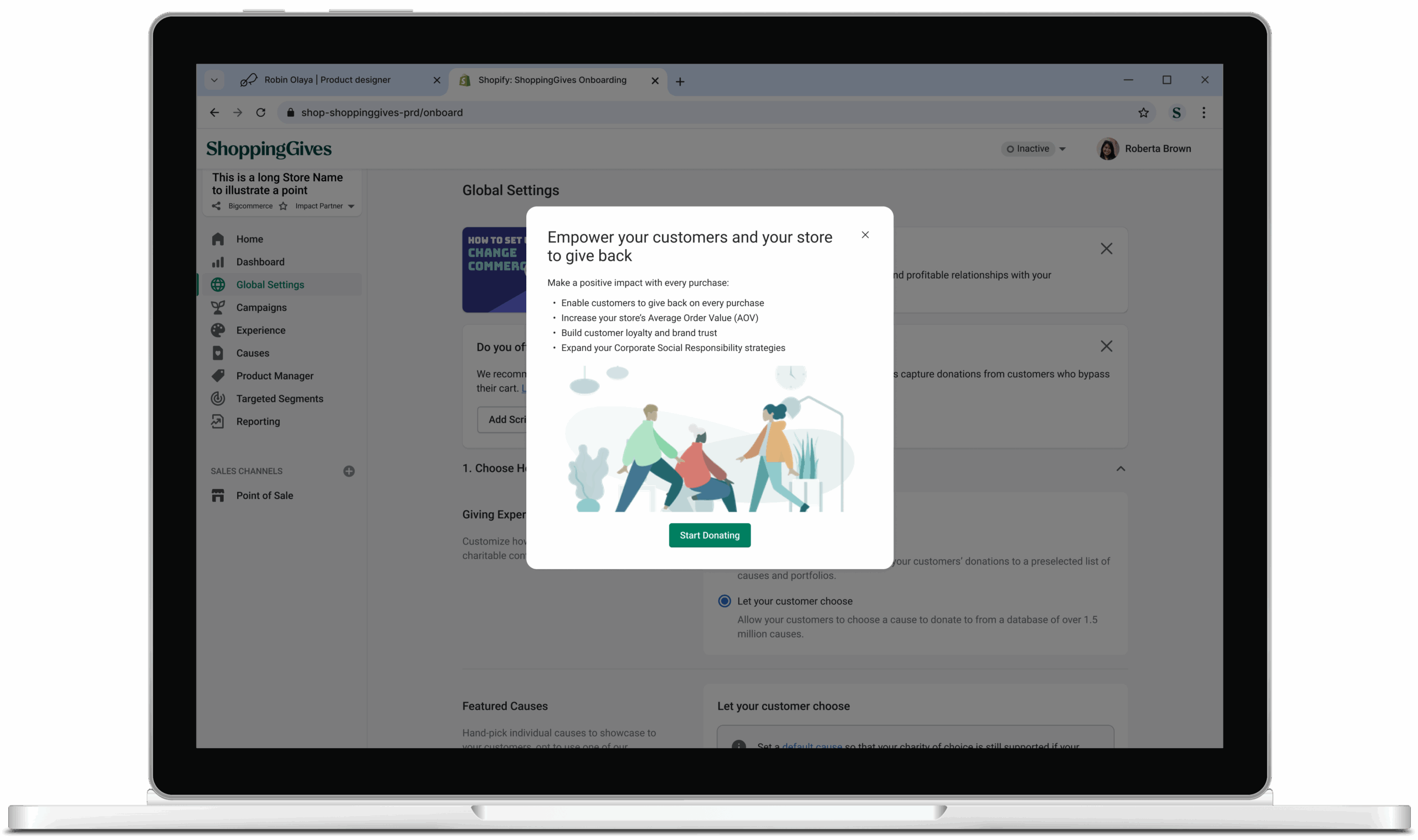
Optimizing the onboarding experience increased merchant activation rates by 20%.
Password required

WP Engine
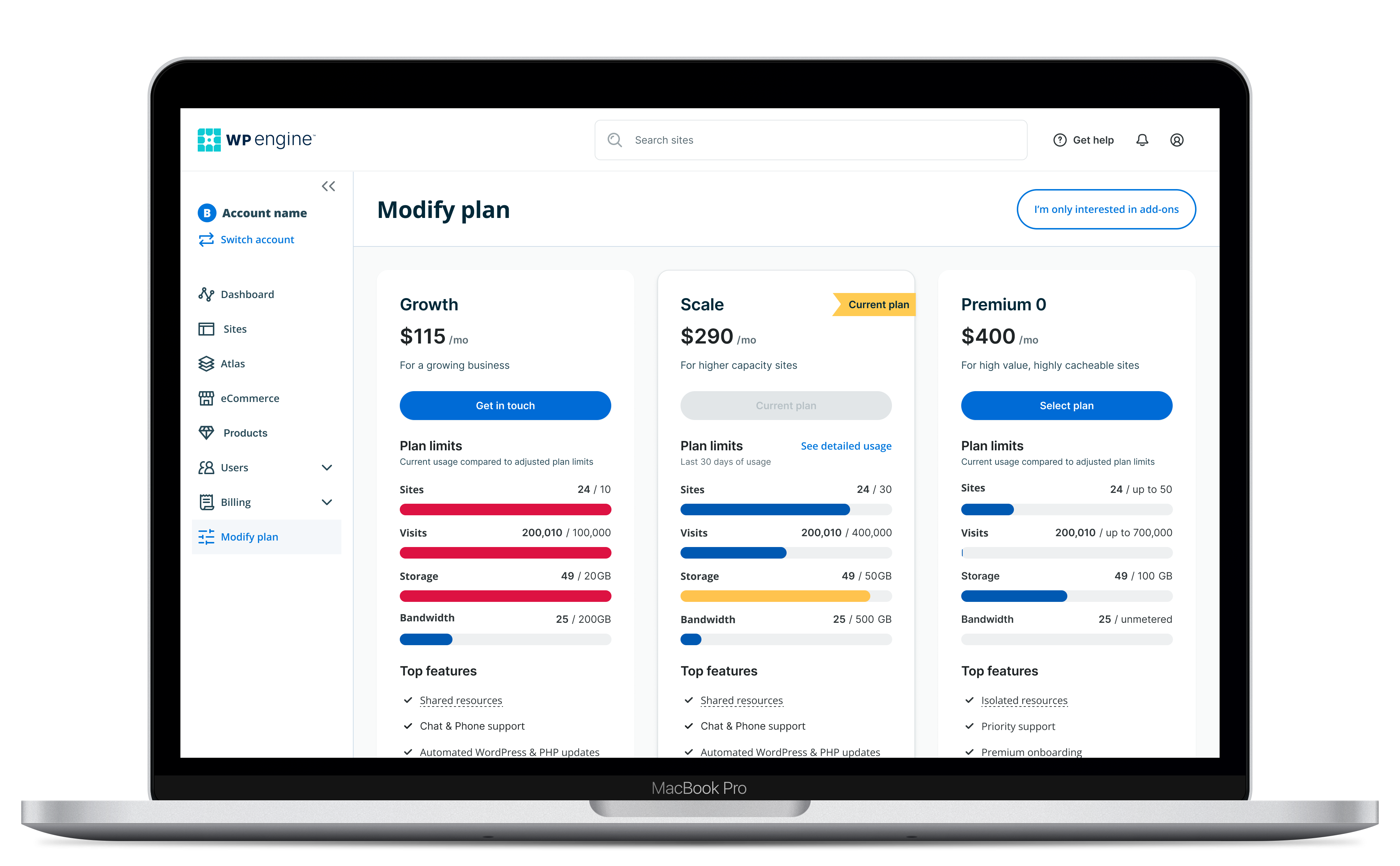
Redesigning the plans page to facilitate self-serve upgrades saved internal teams 206.5 hours.
Password required