Redesigning the plans page led to an average 127 increase in plan upgrades
By educating customers on their latest usage and comparing it to alternative plans, it resulted in an 127 plan upgrades over a 40-day period.


Overview
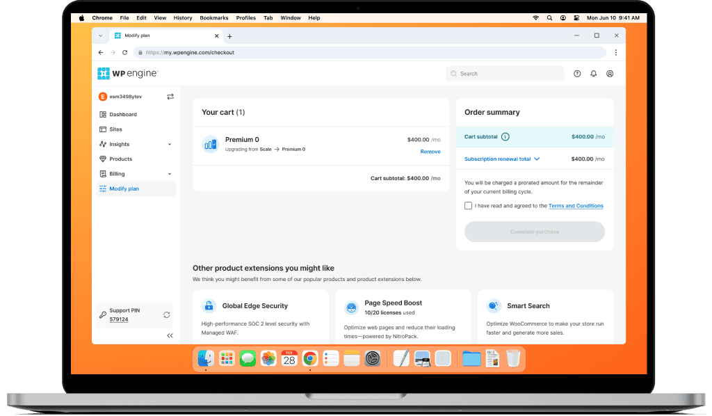
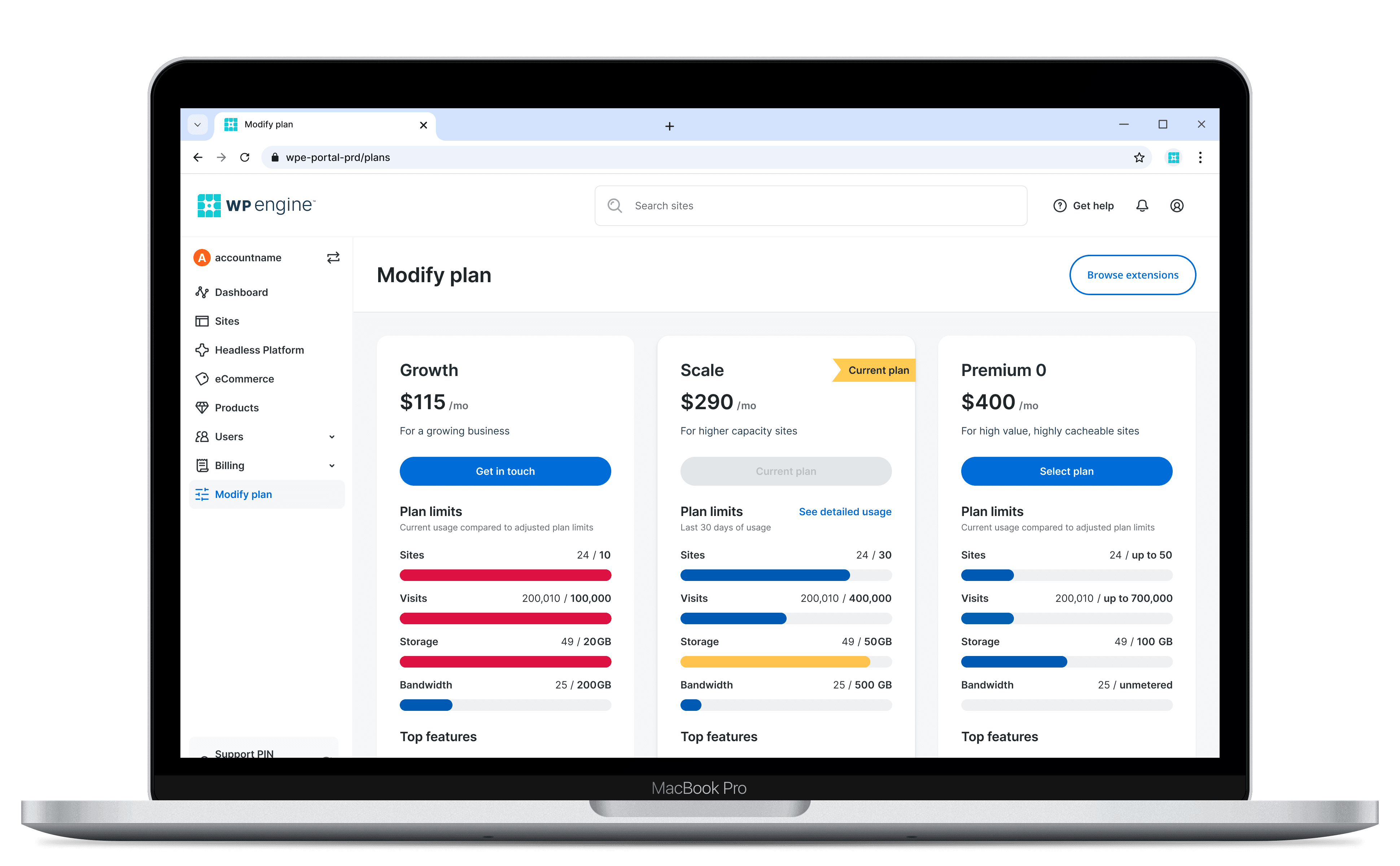
The core feature visualizes their 30-day usage to help users make informed decisions, based on their resources. The user flow, previously directed to sales and support, now allows customers to modify their plan without speaking to an agent.
Project details
Company
WP Engine
Leading WordPress hosting providing fast, secure, and scalable solutions
Role
Designer
End-to-end design, Prototyping, Interaction design
Team and Stakeholders
10+ People
1 Product manager, 8 Developers, 1 Engineering manager, 1 Data analyst, 1 UXR
Timeline
4 Months
Dec 2023 – Apr 2024
Tools
Various
Figma, Zoom, Looker Studio (track conversions), Segment (customer tracking), Miro, Pendo (user journey)
Type
Desktop
Redesign and flow enhancement focused on migrating customers to a self-serve platform
The problem
Customers struggle to understand the resource consumption of their current plan causing decision-making and plan modifications to feel confusing and incomplete.

RESEARCH
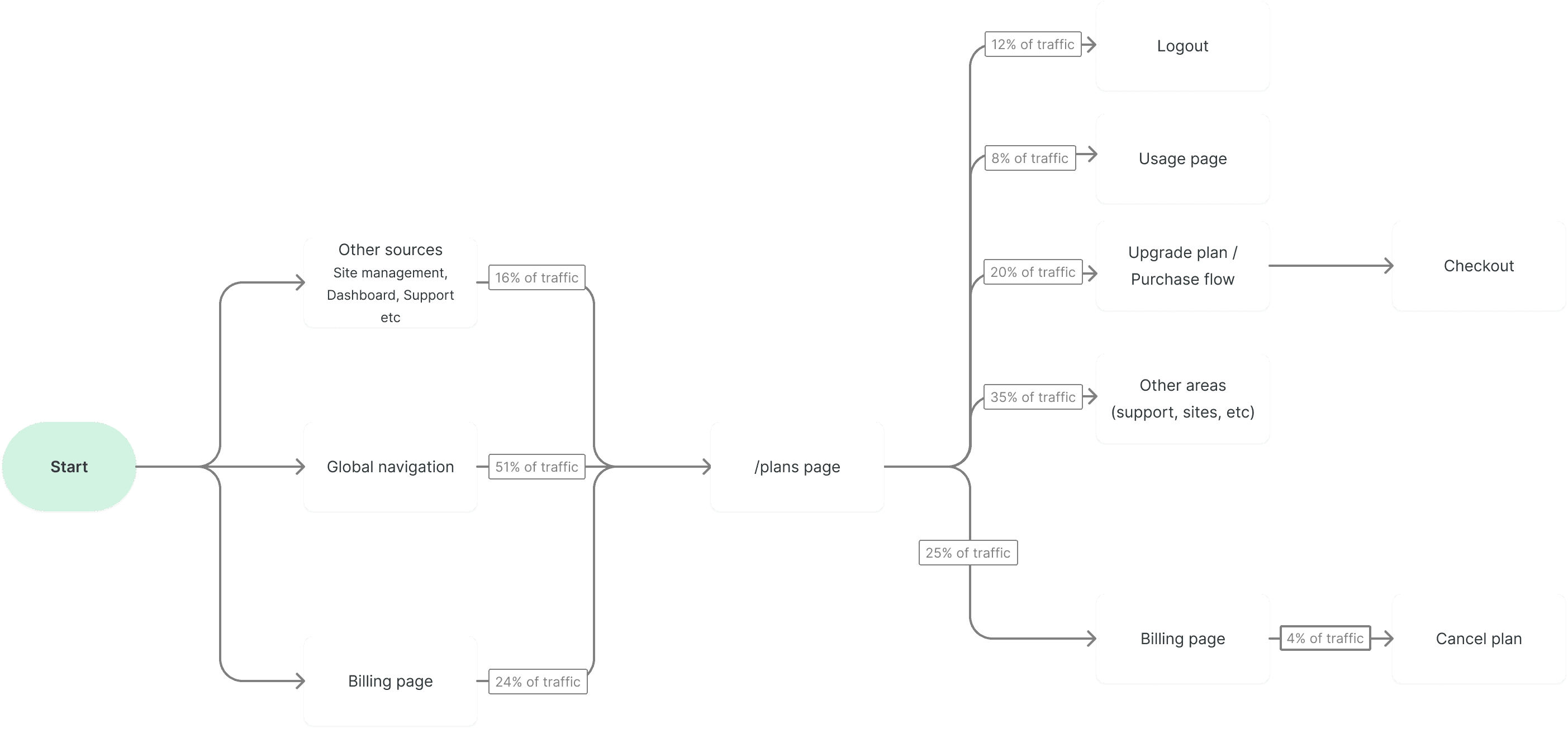
Analysis of 30-day traffic revealed users are searching for data around their usage
Disparate data sources, like the Plans, Usage, and Billing pages signal that users are looking for more info.
Users accessing the Plans page via global navigation have the highest conversion probability, making this a great opportunity for cross-selling and upgrades.
Traffic originating from the billing page, shows a direct correlation with billing related tasks such as cancellations.
Customer toil was caused by static information
and disparate data
1
Static plan info provided little value to 6k monthly customers
The current page was designed for browsing, not plan management.
It lacked real-time data, but boasted a feature list resulting in users seeing an incomplete picture, despite 51% of traffic having strong intent to upgrade.
Users manually compare usage with 8% of users leaving for the usage page
Interviews revealed users open multiple browser tabs to compare their current usage and feature lists to their current plan.

2
3
Lack of clarity led to plan abandonment and cancellations
Generic plan names and lack of data led to user confusion when assessing overall plans. 25% of visitors continue onto the billing page and 4% ultimately cancel their plan.
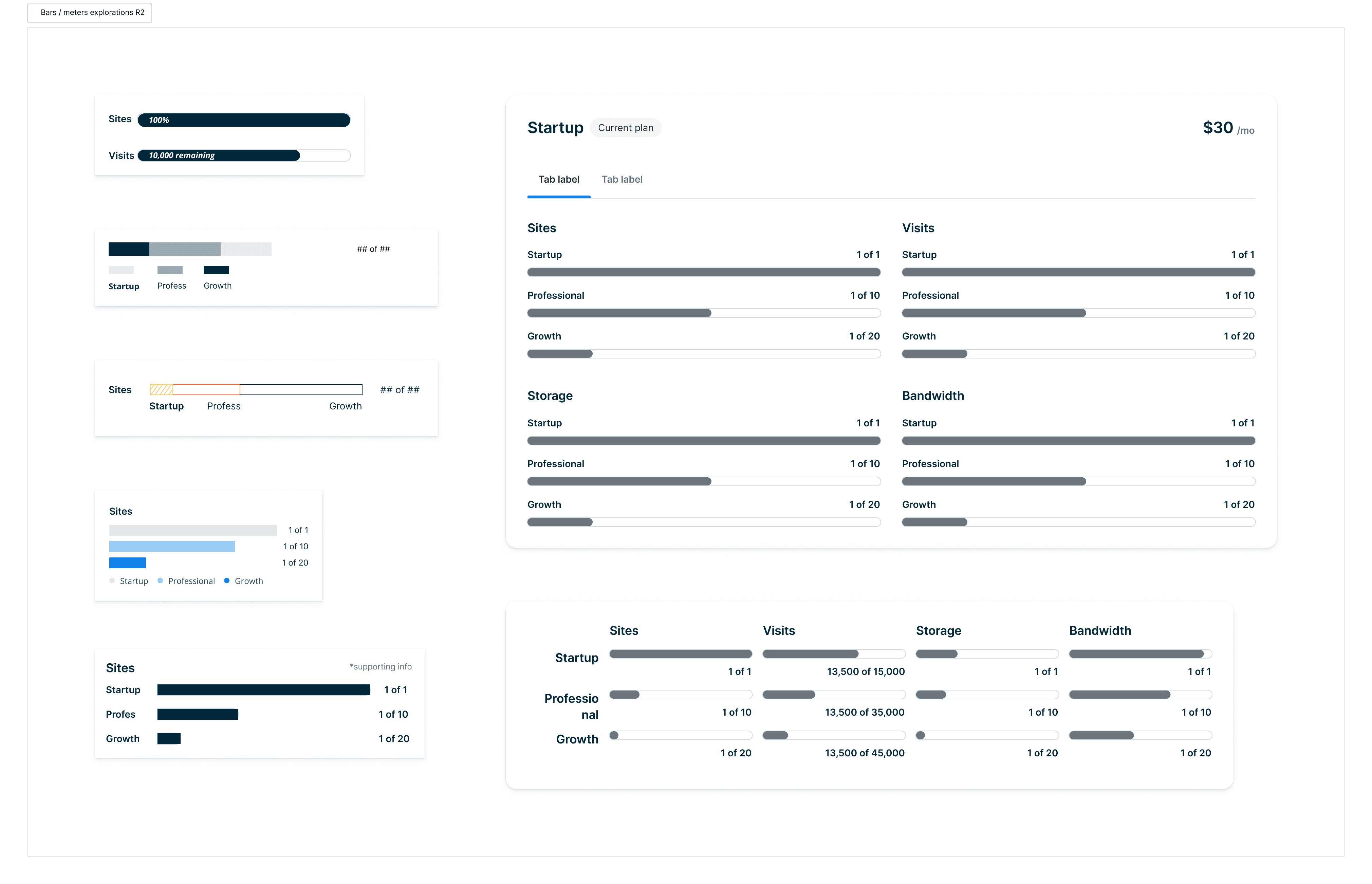
Explorations
1
Abstraction of their 30-day usage
Research indicates their usage is highly relevant to decision making. Providing an abstraction of their core plan entitlements can simplify their multi-tab workflow.
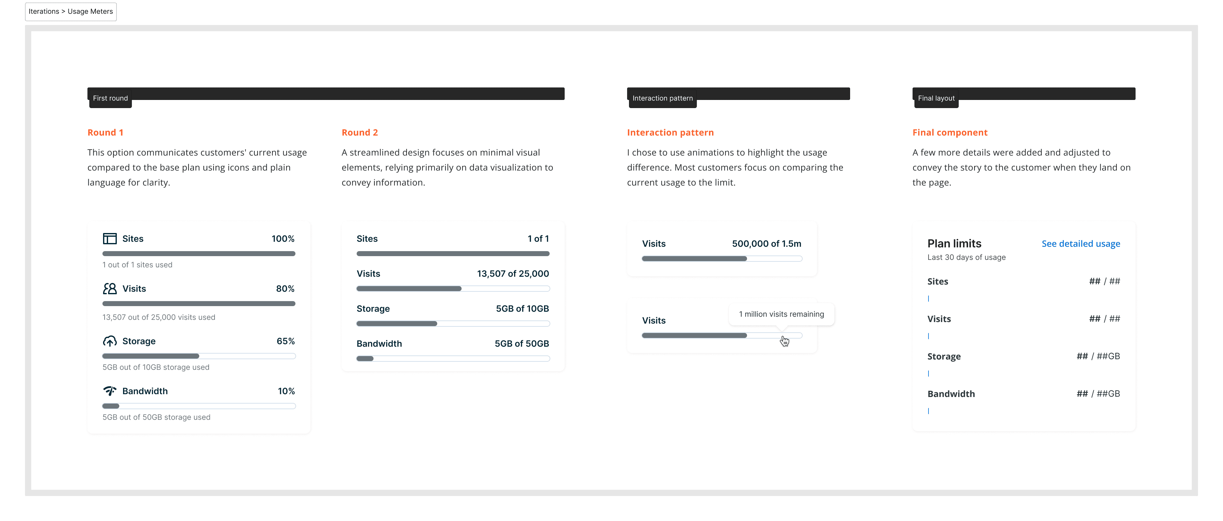

2
Users manually compare the marketing page to compare feature sets
I should spend some time talking about the feature table that we incorporated on the page.

3
To promote customer trust we provide recommendations purely based on their usage
Gone are the days of upsells and plan recommendations and solely based on their 30-day usage.
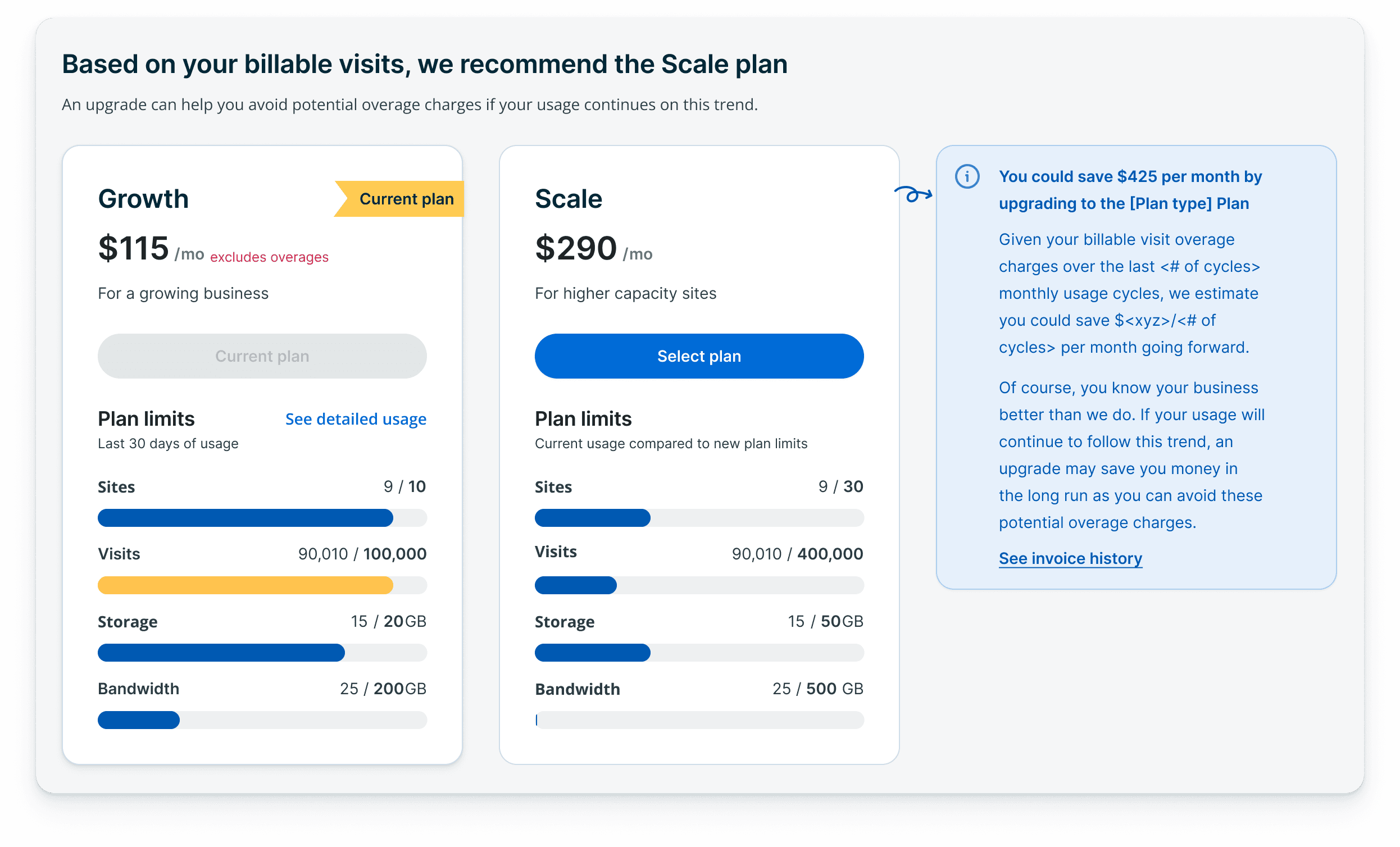
Solution
We not only eliminated user friction and ambiguity, but customers were able to make hosting related decisions, on their own terms, based on 30-day usage data.
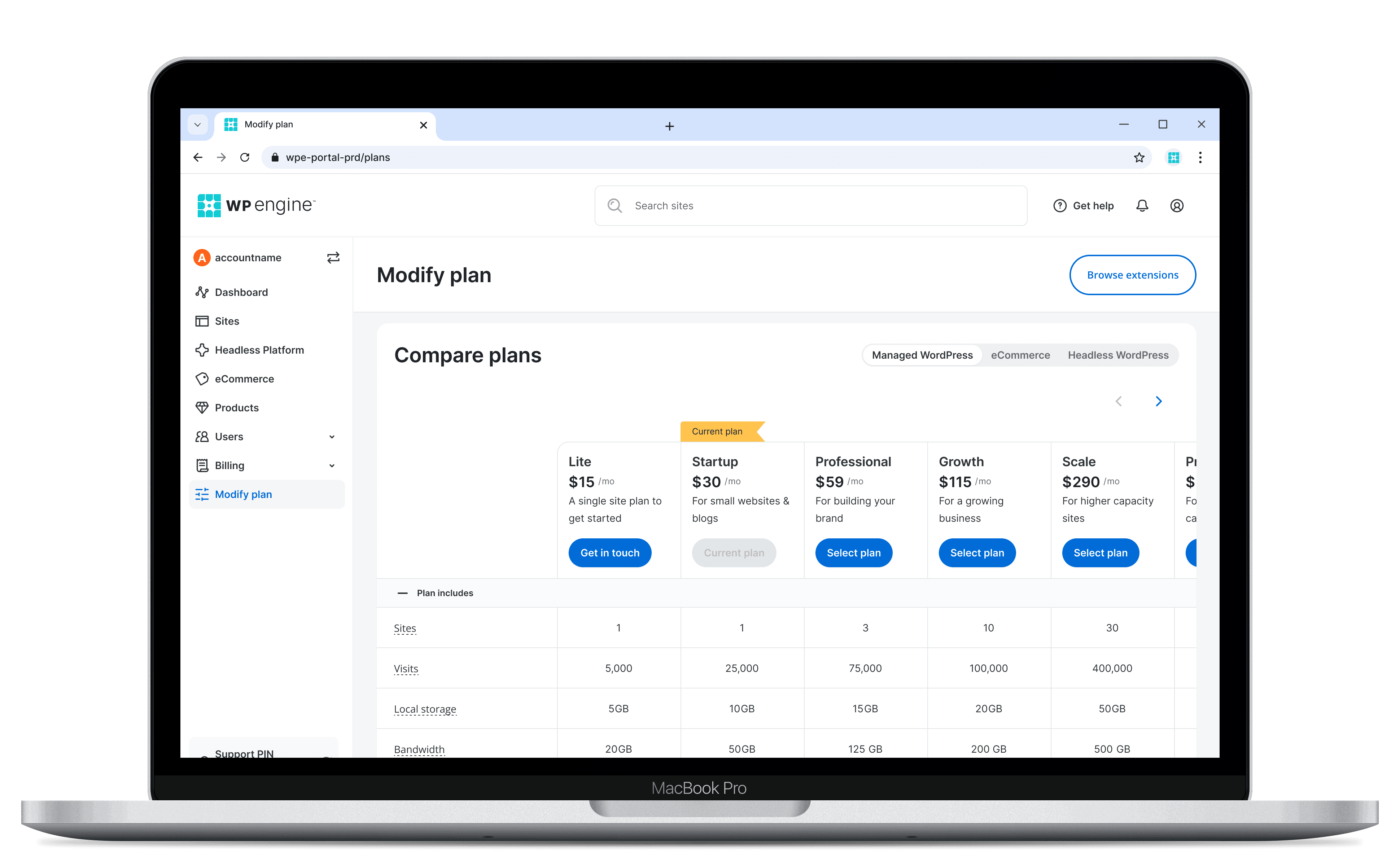
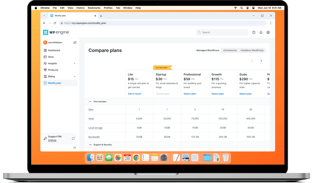
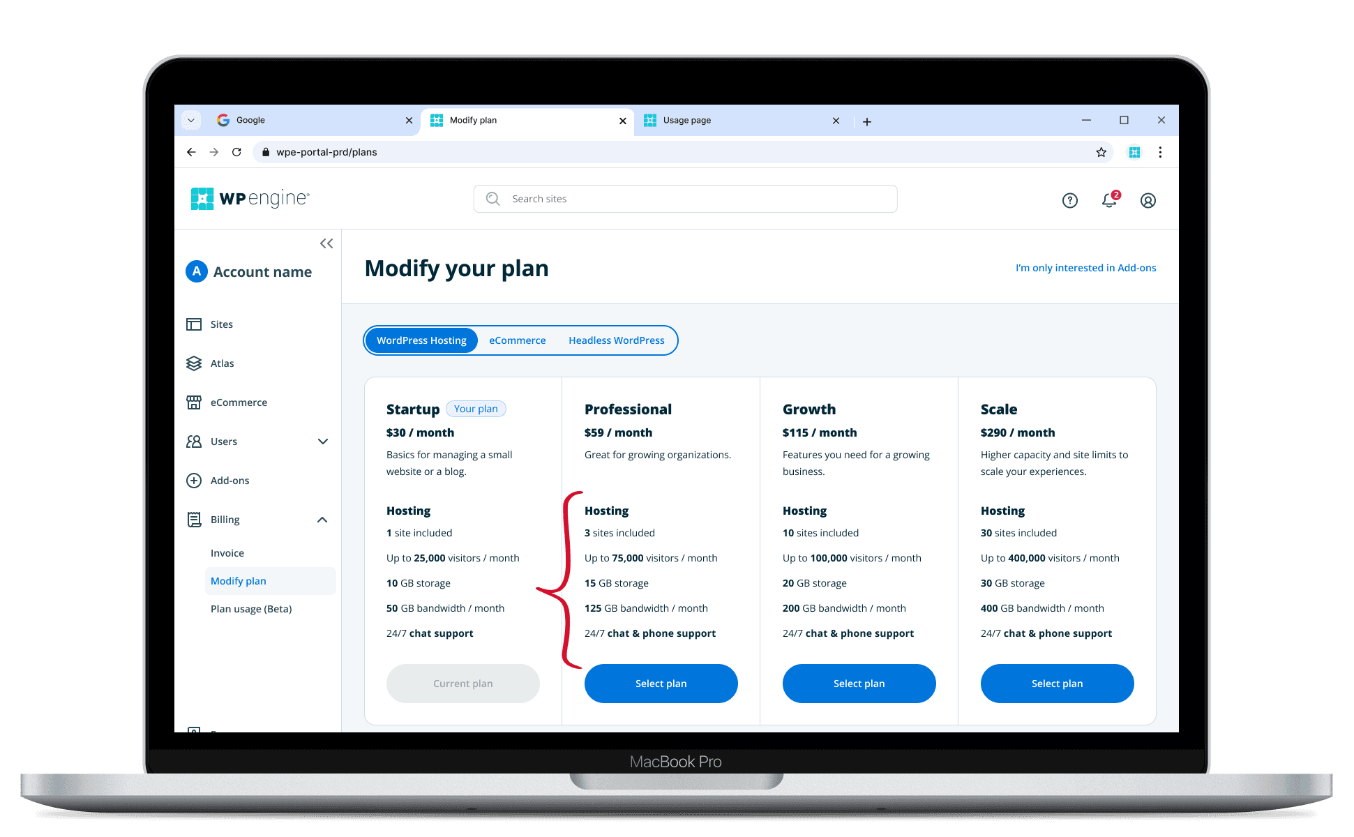
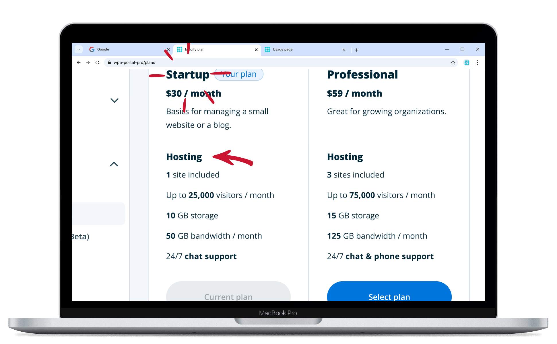
Feature table for easy comparison
For technical customers they're able to compare specs and features across multiple plans. Allowing them to provide the best recommendations for their clients and company.
Results
The work achieved significant increases across core purchase and upgrade funnel metrics, particularly by improving conversion rates and increasing the percentage of sales that are self-serve.
127
Self-serve plan upgrades occurred over a 40 day period after release.
3
Plan upgrades (on average) per day over 40 day period after release.
8
Plan upgrades / month from Startup to Professional (1 site plan to a 3 site plan) indicating stickier customers.